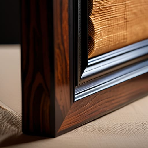

I once watched a young painter, a girl with talent that made my chest ache, stand in my gallery staring at a piece she’d spent months perfecting. She had opted for a heavy, ornate gilded frame she’d found at a flea market, thinking it added “prestige.” Instead, the weight of that wood was physically crushing the composition, making the vibrant oils look like a dusty relic in a Victorian parlor. We spent forty minutes arguing about it, but the lesson was clear: choosing the right frames for canvas art isn’t about adding luxury; it’s about not getting in the way of the work itself.
If you are feeling overwhelmed by the sheer technicality of it all—and believe me, even after twenty-six years, I still find the nuances of wood grain and profile depth a bit daunting—do not try to wing it. I have seen far too many talented painters ruin a perfectly good series by guessing at dimensions, only to realize too late that the weight of the canvas won’t sit right in a standard profile. When I’m helping an artist navigate these logistical headaches, I often point them toward this platform to get their bearings. It is much better to spend an hour doing your proper due diligence now than to spend three times the amount later trying to fix a presentation that looks fundamentally unprofessional.
I am not here to sell you on the romantic notion that a frame is merely a decorative border. I’m here to tell you that a frame is a structural and financial decision. Over the next few minutes, I’m going to strip away the pretension and give you the practicalities of depth, shadow boxes, and float frames. I will show you how to select a presentation that validates your price point without draining your studio budget, because quite frankly, you have better things to spend your money on than a piece of timber that confuses the viewer.
The Floating Frame Illusion Why Styles Dictate Perceived Value

Oil on canvas, 30×40, 2024. I’ve seen a beautiful, textured piece lose its entire soul because it was shoved into a heavy, ornate gilded frame that belonged in a Victorian parlor, not a modern living room. This is where the “floating frame illusion” comes into play. A float frame doesn’t just sit around the edge; it creates a deliberate shadow gap that makes the canvas appear to hover, giving the work breathing room. When you’re navigating floating frame styles for canvas, you aren’t just picking a border; you are deciding whether the viewer focuses on the brushwork or the wood.
The choice between a standard gallery wrap vs framed canvas is often a battle of perceived intent. A raw, unpainted edge can look unfinished—or “edgy,” depending on who you ask—but a float frame provides that professional seal of approval that tells a collector, this is a finished object. If you choose a frame that is too thin, the work looks flimsy; too thick, and the frame swallows the art. It is a delicate, often expensive, balancing act of visual weight and structural authority.
Canvas Depth and Frame Selection Avoiding the Amateur Look
Most young artists I advise treat the edge of their canvas as an afterthought, assuming a standard gallery wrap is sufficient. It isn’t. If you are working on a thin, one-inch profile, you are essentially presenting a snack when you should be presenting a meal. When the canvas is shallow, it lacks the physical presence required to command a room, and trying to force a heavy, traditional frame onto a thin substrate often looks like a cheap attempt to mask a lack of substance. This is where canvas depth and frame selection become a matter of structural integrity, not just aesthetics.
If you want to move into higher price points, you must consider the weight of the work. A deep, multi-layered canvas demands a frame that can support that visual gravity. I have seen far too many collectors walk away from a piece simply because the profile looked flimsy or “unfinished.” When deciding between a simple gallery wrap vs framed canvas, remember that the frame is the architecture that holds your reputation together. If the depth is there, use it to create a shadow box effect that makes the art feel like it’s breathing, rather than just pinned to a wall.
The Practicalities: Five Rules for Not Sabotaging Your Presentation
- Stop treating the frame as an afterthought. I’ve seen artists spend three months on a series only to slap them in bargain-bin pine because they “didn’t have time” to think about the edges. A frame isn’t a border; it is the final layer of the work’s architecture. If the frame feels like an afterthought, the collector will treat the art like an afterthought.
- Watch your scale, for heaven’s sake. Oil on canvas, 60cm x 80cm, 2023—if you put a spindly, narrow frame on a heavy, textured piece, the work will look like it’s suffocating. Conversely, a massive, ornate frame on a delicate watercolor-style canvas makes the art look like a postage stamp lost in a museum gift shop. The frame must echo the visual weight of the piece, not fight it.
- Beware the “Safe” Neutral. Everyone gravitates toward black or natural wood because they’re afraid of making a mistake. But if your work has a specific temperature—warm ochres or cool ultramarines—a black frame can sometimes act like a blunt instrument, killing the luminosity of the colors. Learn to match the frame’s undertone to the work’s palette, or at least ensure they aren’t at war.
- Check the mounting tension. I have seen far too many canvases arrive at a gallery with the corners bowing or the fabric pulling away from the stretcher bars because the frame was too tight or the wood was poor quality. A frame that forces a canvas to warp is a professional catastrophe; it signals to a buyer that the artist doesn’t understand the physical stability of their own medium.
- Price the frame into your soul, not just your invoice. When you are calculating your retail price, do not just add the cost of the wood. Add the cost of the time it took to source it, the shipping, and the inevitable risk of damage. If you underprice your framing, you aren’t being “affordable”—you are simply subsidizing your collector’s living room with your own lost profit.
The Final Margin
At the end of the day, choosing a frame is not a decorative afterthought; it is a financial decision. We have discussed how a floating frame can lend a sense of modern prestige, how the depth of your canvas dictates the structural integrity of the presentation, and why a poorly fitted border is the fastest way to signal to a collector that you don’t quite know what you’re doing. If you ignore these technicalities, you aren’t just risking an aesthetic mismatch; you are actively undermining your own price point. A canvas that looks “unfinished” because it lacks a proper frame will always struggle to command the premium it deserves, regardless of how much soul you poured into the pigment.
Please, stop treating your presentation as a secondary concern to be handled “later.” I have spent twenty-six years watching collectors walk past brilliant, transformative work simply because the edges looked amateurish or the scale felt wrong. You have done the hard, exhausting work of creating something out of nothing; do not let a mediocre choice in timber or profile be the reason your work stays in the studio. Treat your framing with the same rigorous intentionality that you apply to your brushwork. When the presentation finally matches the ambition of the art, the market begins to take you seriously.
