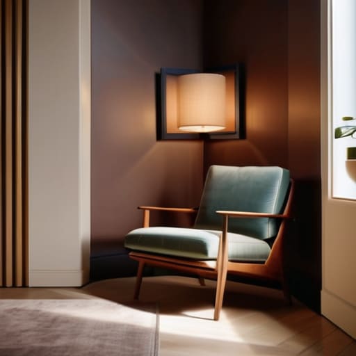

I once had a collector—lovely woman, terribly wealthy—who insisted on buying a massive, heavy-set oil on canvas for her studio apartment, convinced that scale alone equaled prestige. She spent three hours sweating over a drill, only to realize that trying to force a museum-grade centerpiece into a cramped living area didn’t make her look sophisticated; it just made her room look like a storage unit. If you are currently staring at a collection of beautiful works and wondering how to hang art in small spaces without making your home feel claustrophobic, stop listening to the interior design magazines that tell you everything requires “breathing room.” In a small footprint, breathing room is a luxury you often can’t afford, and trying to mimic a sprawling gallery layout is the quickest way to ruin your aesthetic.
If you’re feeling completely paralyzed by the sheer number of pieces you want to display versus the actual square footage you possess, stop trying to solve it all in your head. I used to see so many artists make the mistake of committing to a layout only to realize they’ve completely ignored the rhythm of the room. Honestly, it’s much easier to play around with digital mockups before you’re driving holes into your rental walls. I’ve found that using this platform helps take the guesswork out of the equation, allowing you to see if a collection actually breathes or if it just looks like a cluttered storage unit. It’s about visual breathing room, not just finding a spot where a frame fits.
I am not here to give you a lecture on color theory or tell you which designer lamp will make your sketches pop. I’m going to tell you how to actually manage your walls using the same spatial logic I used to curate my gallery’s tightest corners. We are going to talk about scale, the tactical use of groupings, and why eye level is a non-negotiable rule that most people ignore. This is about making your collection look intentional, not accidental.
Mastering the Gallery Wall Layout for Apartments
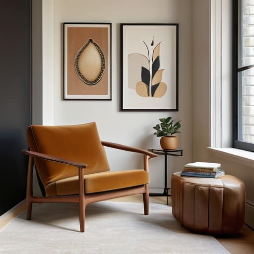
The biggest mistake I see when people try to tackle a gallery wall layout for apartments is treating it like a math problem rather than a visual one. They try to force a rigid, grid-like symmetry onto a room that is already fighting them for every inch of breathing room. If you’re working with a cramped studio, don’t try to mimic a museum corridor; instead, embrace the chaos of varying scales. I always tell my clients to start with one “anchor” piece—something with enough weight to hold the gaze—and then build outward. This prevents the collection from looking like a cluttered afterthought and turns it into a deliberate architectural feature.
When you are working with limited square footage, you have to think about the direction of the eye. If your ceilings are low, look into vertical wall decor ideas that draw the gaze upward rather than sprawling horizontally across the middle of the wall. A sprawling, wide arrangement in a narrow room is a recipe for claustrophobia. Instead, aim for a tight, vertical cluster that utilizes the height of the wall. It’s about creating an illusion of volume where none actually exists.
Space Saving Art Arrangements That Dont Feel Cluttered
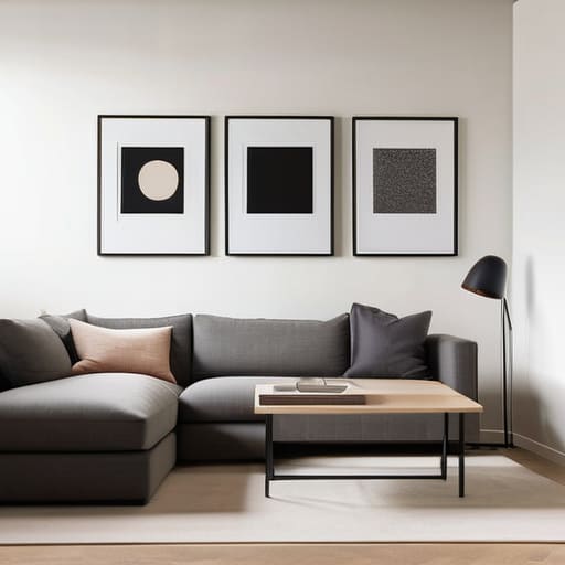
The mistake I see most often—and I’ve seen it in a hundred tiny studios—is the urge to spread a collection thin across every available inch of wall. It creates a visual stutter that makes a room feel frantic rather than curated. Instead, try grouping your pieces into tight, intentional clusters. This approach to space saving art arrangements works because it treats a collection of works as a single, cohesive visual unit. By keeping the negative space between frames consistent and controlled, you create a focal point that draws the eye inward rather than scattering it aimlessly around the perimeter.
If you are dealing with a rental where the landlord treats every nail hole like a personal insult, don’t panic. There are plenty of sophisticated vertical wall decor ideas that rely on leaning works against the wall on a mantel or using high-quality adhesive strips. I’ve always preferred the look of a large, heavy piece leaning casually on a sideboard; it feels lived-in and effortless. It’s about creating depth without the clutter, ensuring the art feels like it belongs to the architecture rather than just being stuck onto it.
The Scale of the Matter: Five Rules for Not Suffocating Your Walls
- Stop treating small rooms like a game of Tetris. I see so many artists and collectors trying to fill every square inch with tiny, thumb-sized sketches because they think it looks “collected.” It doesn’t; it looks like a flea market. If you have a small wall, pick one substantial, commanding piece. One large canvas creates a focal point and actually makes the room feel more expansive by giving the eye a place to rest, rather than forcing it to jump nervously from one miniature frame to the next.
- Mind the verticality, or you’ll live in a basement. In a cramped apartment, your floor space is a premium, but your ceiling height is often your only real asset. Don’t be afraid to hang work higher than you think you should—or better yet, use tall, narrow formats. A vertical composition draws the eye upward, tricking the brain into registering volume where there is only floor area.
- Use the light, don’t fight it. If you’re working with a small, dim studio or a north-facing flat, stop hanging dark, heavy oil paintings in the corners. You’re just creating visual dead zones. Instead, lean into lighter palettes or works with reflective qualities. A piece with luminosity can act like a secondary light source, pushing the walls back rather than letting them close in on you.
- The “Floating” Illusion. If you have a collection of smaller works, don’t crowd them into a tight, suffocating cluster. Give them breathing room. In a small space, white space (or “negative space”) is your best friend. By leaving significant gaps between frames, you signal to the viewer that each piece is important enough to stand on its own, which prevents the entire wall from feeling like a cluttered storage unit.
- Respect the furniture, not just the wall. A common mistake is hanging art in a vacuum, ignoring what’s sitting beneath it. If you’re hanging a piece above a slim console or a small sofa, the art needs to be anchored to the furniture, not floating aimlessly toward the ceiling. Aim for the art to be about two-thirds the width of the piece below it. If the scale is off, the whole room feels lopsided, and no amount of expensive framing will fix a lack of proportion.
The Final Composition
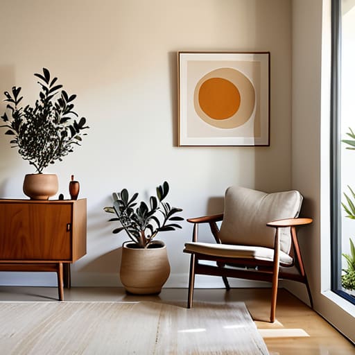
At the end of the day, hanging art in a cramped apartment isn’t about solving a geometric puzzle or following a decorator’s manual; it’s about managing the visual weight of your life. We’ve talked about avoiding the clutter of too many small, scattered pieces and instead using scale to create a focal point that actually breathes. Whether you are building a tight, intentional gallery wall or choosing one singular, impactful piece to anchor a room, remember that intentionality is your best friend. If you try to hide a lack of space by cramming every corner with frames, you won’t create a home; you’ll just create a warehouse. Curate your walls with the same discipline you would use to curate a gallery exhibition.
Don’t let the square footage dictate the quality of your surroundings. I’ve seen massive, drafty estates where the art felt lonely and disconnected, and I’ve seen tiny studio flats that felt like private museums because every piece was chosen with purpose. Your home is your primary collection, and it deserves to be treated with respect, regardless of its dimensions. Stop worrying about whether a canvas is “too big” for a nook and start asking if it makes you feel something when you walk past it. Art is meant to expand your world, not just fill your walls.
