
I remember sitting in the back of a crowded studio during a mid-career retrospective in 2004, watching a young painter frantically squeeze every single tube of expensive cadmium and cobalt onto a plastic tray, convinced that more pigment equaled more talent. It was a mess of muddy, competing vibrations that looked less like a masterpiece and more like a chemical spill. Most artists think they need a hundred different shades to achieve depth, but that’s just a way to bleed your bank account dry without actually gaining any control. Learning how to build a limited palette isn’t about deprivation or playing small; it’s about the strategic discipline required to make every single stroke count.
I’m not here to give you a lecture on color theory that you could find in any dusty textbook. Instead, I’m going to tell you how to stop being a slave to your supplies and start making intentional decisions. I will show you how to select a core group of pigments that work together, why a restricted range actually increases the market value of your work by creating a signature cohesion, and how to master the mixing that matters. No fluff, no expensive kits—just the hard truth about making your colors work for you.
Pigment Selection for Artists Investing in Quality Over Quantity
Listen, I have seen too many young painters walk into a supply shop and walk out with a massive, expensive kit of twenty-four mediocre tubes, thinking they are “prepared.” They aren’t. They are just cluttered. When you are working with a restricted set, every single tube has to earn its keep. This is where pigment selection for artists becomes a matter of professional survival rather than just a shopping list. If you buy a cheap, heavily extended cadmium yellow, you will find that no matter how much you mix, you can never quite hit that luminous, sun-drenched note required for a serious piece.
You aren’t just buying color; you are buying chromatic integrity. I always tell my clients that a small collection of high-grade, single-pigment paints is infinitely more valuable than a mountain of student-grade sludge. When you understand the chemistry of your tools, you stop fighting your materials and start mastering color mixing techniques that actually hold up under a gallery light. A tight, high-quality kit allows for a painterly color economy where your transitions are seamless and your shadows don’t turn into a muddy, grayish mess. Spend the money on the pigment, not the quantity.
The Painterly Color Economy Maximizing Impact With Minimal Assets
Think of your palette not as a buffet, but as a curated inventory. In my years running the gallery, I saw far too many emerging artists stumble into the trap of thinking a massive, expensive range of tubes equated to professional capability. It doesn’t. In fact, it often does the opposite. When you have too many options, you lose the ability to control the temperature of your work, resulting in those muddy, indecisive neutrals that scream “amateur” to a seasoned collector. A painterly color economy is about discipline; it is about knowing exactly how much structural weight a single, well-placed cadmium can carry.
True mastery lies in understanding how to manipulate a few high-quality pigments through sophisticated color mixing techniques rather than relying on the convenience of pre-mixed hues. When you restrict your assets, you are forced to engage deeply with the underlying logic of your work. You begin to see that achieving color harmony isn’t about having every shade of violet available in a tube, but about understanding how a strategic strike of a complementary color can make a dull grey vibrate with life. It is about making every single stroke count toward a cohesive, intentional whole.
The Cost of Indecision
Most artists think a massive, sprawling collection of tubes is a sign of readiness, but in a gallery setting, it often looks like a lack of discipline. A limited palette isn’t about being poor; it’s about being intentional. When you master five colors instead of fifty, you aren’t just making a painting—you’re creating a visual language that actually has something to say, rather than just shouting in every key at once.
Vivienne Ashworth-Pryce
The Discipline of the Limited Palette
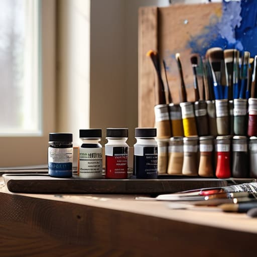
At the end of the day, building a limited palette isn’t about being cheap or lacking imagination; it is about the rigorous management of your visual assets. We have discussed why investing in high-grade pigments is non-negotiable and how a streamlined selection allows you to master the interplay of temperature and value rather than getting lost in the chaos of a hundred different tubes. When you stop reaching for that specific, expensive shade of turquoise every time you feel a momentary lapse in confidence, you start making decisions based on intent. You move from being a consumer of color to a strategist of light, ensuring that every mark on the canvas serves a structural purpose rather than just filling a void.
I spent decades looking at thousands of canvases in my gallery, and I can tell you that the works that truly stop a collector in their tracks rarely rely on chromatic excess. The most commanding paintings are those where the artist has wrestled with their limitations and come out on top. Don’t fear the restriction; embrace it as the very thing that will give your work its signature voice. A tight palette isn’t a cage—it is a foundation for mastery. Go back to your studio, clear the clutter off your palette, and see what you can actually achieve when you finally stop hiding behind a rainbow.
Frequently Asked Questions
If I'm working with a very small selection of pigments, how do I prevent my paintings from looking muddy or "dead" after a few layers?
Oil on linen, 30 x 40cm, 2024. It’s the most common fear I hear from artists trying to be disciplined, and it’s a valid one. Mud happens when you lose control of your transparency. If you’re working with a tiny kit, you must respect the physics of your pigments. Use thin, transparent glazes to build depth rather than slapping opaque layers on top of each other like spackle. If you keep mixing everything into a grey sludge, you aren’t being “minimalist”—you’re just being messy. Control your light, or the color will die.
Is there a specific way to transition from a limited palette to a full kit without losing the cohesive look that makes my work recognizable to collectors?
Oil on linen, 24×30, 2024. I like the question, because it’s the one artists ask right before they ruin their brand. Look, you don’t “expand” your palette; you evolve it. If you suddenly start using every neon tube in the shop, you’ll look like a different person entirely. Introduce new hues through broken color—mix your new pigments into your established range. Keep the DNA of your color relationships intact, or collectors will stop recognizing your work.
How do I justify the higher upfront cost of professional-grade pigments when I'm trying to keep my studio overhead manageable?
Oil on linen, 16×20, 2024. It’s a matter of math, darling, not just aesthetics. You aren’t “spending” money on professional pigments; you are preventing it from evaporating. Cheap student-grade tubes are essentially colored chalk; they fade, they shift, and they lack the lightfastness a collector expects when they’re dropping four figures on a piece. I’ve seen far too many artists try to save fifty pounds on paint only to find their reputation tarnished by a muddy, fugitive landscape three years later. Buy the good stuff. It’s cheaper in the long run.
