
If you go searching for a “complete guide to watercolour” online, you will be buried under a mountain of expensive, professional-grade pigment recommendations and lectures on the “spiritual connection” between the artist and the water. It’s exhausting. I spent twenty-six years in a gallery watching young artists sink hundreds of pounds into the most prestigious Swedish paper and hand-ground pigments, convinced that the tools would somehow compensate for a lack of structural understanding. Let me tell you a secret: I’ve seen mediocre works on museum-quality stock sell for nothing, and I’ve seen breathtaking, raw pieces on cheap paper command prices that would make a seasoned collector weep. The magic isn’t in the price tag of your brush; it’s in the control you exert over the medium.
I am not here to sell you a dream or a specific brand of pan. Instead, I’m going to give you the unvarnished reality of how this medium actually behaves when you stop treating it like a chemistry experiment and start treating it like a tool for communication. We are going to skip the fluff and focus on the mechanics that actually matter—the stuff that makes a piece look intentional rather than accidental. This is about building a foundation that survives the market, not just a pretty wash on a page.
Professional Watercolour Supplies Investing in Value Not Just Hype

I’ve sat in my gallery for decades watching collectors stare at a piece, and I can tell you this: they aren’t looking at your brushstrokes; they are looking at the luminosity. You cannot fake that with student-grade pans. When I advised my artists, I told them the same thing I’m telling you: stop hoarding cheap tubes and start investing in professional watercolour supplies. Cheap pigments are essentially colored chalk; they lack the lightfastness that makes a collector feel their investment is safe, and they clog up during layering and glazing methods, leaving your work looking muddy rather than translucent.
It isn’t just about the paint, either. If you are using a synthetic brush that holds water like a sponge made of plastic, you will never master the wet on wet technique because you’ll have zero control over the flow. You need tools that respect the medium. I’ve seen many a talented artist struggle simply because they were fighting their materials instead of dancing with them. Buy the good paper, buy the single-pigment paints, and for heaven’s sake, buy a brush that won’t lose its shape after three washes.
Pigment Granulation Explained Why Texture Sells the Story
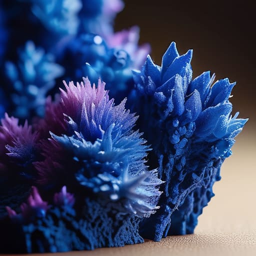
If you’ve ever looked at a piece of work in a gallery and felt that sudden, visceral pull—that sense that the paint isn’t just sitting on the paper but is actually living in it—you were likely responding to granulation. When we talk about pigment granulation explained, we aren’t talking about a technical flaw or a messy accident. We are talking about the physical weight of the color. Certain heavy pigments, like Cobalt Blue or Ultramarine, don’t just dissolve into a flat wash; they settle into the valleys of the paper, creating a granular texture that gives a painting its soul.
I’ve seen too many young artists try to “fix” this by overworking the surface, terrified that a bit of texture looks unpolished. Don’t. If you are using a wet on wet technique, let those particles do the heavy lifting for you. That organic, mottled look is exactly what collectors look for when they want to see the hand of the artist. It provides a sense of depth that a perfectly smooth, flat wash simply cannot achieve. In the commercial world, texture is a value driver; it makes a piece feel expensive because it looks complex.
The Cost of the Craft
Most artists approach a “complete guide” as if they are studying for a chemistry exam, obsessing over pigment loads and paper weights, but they miss the most expensive lesson of all: a technical masterpiece is worthless if you haven’t learned how to price the time it took to tame the water.
Vivienne Ashworth-Pryce
The Bottom Line on Watercolours
At this stage, you should understand that mastering watercolour isn’t about accumulating a mountain of expensive tubes or obsessing over every single granulation effect. It is about the intersection of quality tools and intentionality. We have discussed why investing in professional-grade pigments is a business decision—not just a hobbyist’s whim—and how the physical texture of your work can actually increase its perceived value to a collector. If you use cheap, filler-heavy paints, you are essentially trying to sell a house with a crumbling foundation. You can have all the technique in the world, but if the medium itself lacks integrity, the work will never hold its weight in a serious market.
Ultimately, though, don’t let the technicalities or the price tags paralyze your hand. I spent decades looking at thousands of pieces, and I can tell you that the most “perfect” technical studies are often the most forgettable. Collectors don’t buy a perfect water-to-pigment ratio; they buy the unrepeatable moment captured on the page. Use the best supplies you can afford, understand the science of your materials, but never let the fear of a “mistake” stop you from making a mark. The goal isn’t to produce a textbook illustration; it is to create something that makes a stranger stop walking and actually feel something.
Frequently Asked Questions
If I’m starting out, how do I know if a "student grade" set is actually a waste of money or just a smart way to practice?
Oil on 300gsm cotton, 10×10, 2024. I like the pragmatism of the question. Look, student grade isn’t a scam, but it is a compromise. If you’re just learning how to control a wash without panicking about wasting expensive pigment, go for it. But don’t mistake “practice” for “perfection.” Once you start thinking about how light hits a specific granulating cobalt, those cheap fillers will frustrate you. Buy the student set to learn the physics; buy the professional set to make the art.
When I eventually start selling my work, how do I factor the high cost of professional paper and pigments into my final retail price?
Oil on linen, 30×40, 2024. It’s a lovely piece, but let’s talk about the math. You don’t just add the cost of that expensive Arches paper to your price and call it a day. You must treat your materials as a percentage of your overhead, not a line item. If you price only to cover costs, you aren’t running a business; you’re subsidizing your hobby. Build your margin into the work itself.
How much does the actual technical quality of a watercolour piece matter to a collector compared to the "vibe" or the artist's reputation?
Oil on canvas, 24×30, 2024. I like it, but let’s be honest: a collector isn’t buying your technical mastery of a wet-on-wet wash. They’re buying how that wash makes them feel on a Tuesday afternoon. Reputation gets them through the door, and the “vibe” closes the sale. However, poor technique is a liability; if the paper buckles or the pigments look muddy, the illusion breaks, and the investment feels cheap. Technical skill is the floor, not the ceiling.
