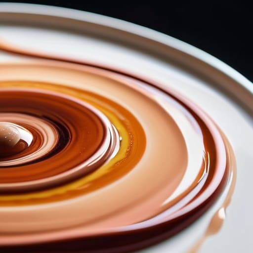

I remember sitting in the back of a crowded studio opening in the late nineties, watching a young painter try to explain to a serious collector why his portraits looked like they were carved from cheap wax. He was using a dozen different “specialty” flesh tints straight from the tube, convinced that the secret to realism was a more expensive palette. It was a lie. Most artists think the secret to life is found in a pre-mixed jar, but if you want to actually learn how to mix skin tones that hold their value under a gallery light, you have to stop looking for magic potions and start looking at undertones.
I am not here to sell you a twenty-piece set of “humanity” pigments or some academic nonsense about color theory that has no bearing on a canvas. I’m going to tell you exactly how to build a believable complexion using the basic colors you already own, focusing on the structural reality of light rather than the superficiality of pigment. We are going to strip away the pretension and focus on the technical mechanics of color, so you can stop guessing and start creating work that actually commands a price.
Mastering Color Theory for Painters and the Lies of Perfection

Most art schools treat color theory for painters like a math equation, as if you can simply add two parts ochre to one part crimson and arrive at a human being. It’s a lie. If you approach a face looking for “flesh color,” you’ve already lost the battle. Real skin isn’t a single pigment; it is a translucent, shifting map of blood vessels, bone, and light. When I used to walk through my gallery, the pieces that commanded the highest prices weren’t the ones with the most “perfect” skin, but the ones that understood the chaos of undertones in portrait painting.
Stop trying to find a shortcut to a flat, peach-toned finish. Whether you are mixing oil paint for skin or working with faster-drying mediums, the secret lies in the layers of temperature. A cheek isn’t just pink; it’s a collision of warmth and cool shadows. If you aren’t looking for the greens and blues hiding beneath the surface, you aren’t painting a person—you’re painting a mannequin. Collectors don’t pay for perfection; they pay for the illusion of life that only comes from mastering that underlying complexity.
Unmasking Undertones in Portrait Painting to Find Real Depth
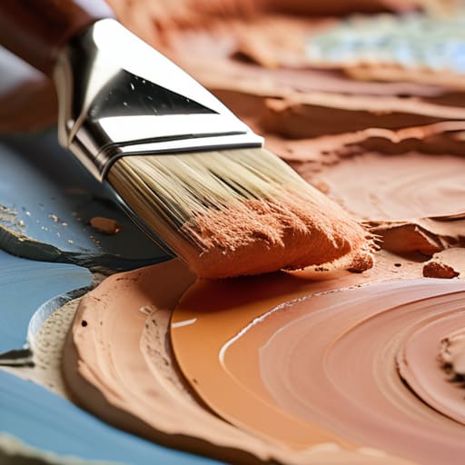
If you think you can just squeeze a tube of “flesh tint” onto a palette and call it a day, you’ve already lost the battle. Real skin isn’t a single color; it’s a translucent, shifting landscape of temperature. When I used to walk through my gallery, the pieces that actually stopped collectors in their tracks weren’t the ones with the “perfect” proportions, but the ones where the artist understood undertones in portrait painting. They knew that a cheek isn’t just pink; it’s a complex map of subtle blues, greens, and ochres fighting for dominance beneath the surface.
Stop trying to mask the anatomy and start layering the truth. Whether you are mixing oil paint for skin or working with faster-drying mediums, the secret lies in the tension between warm and cool. If your portraits look like plastic, it’s because you’ve ignored the venous blues and the sallow yellows that exist in every living face. You aren’t just painting a surface; you are attempting to simulate the glow of blood and light moving through tissue. Master that, and you stop making decorations and start making art.
The Cost of a Flat Face
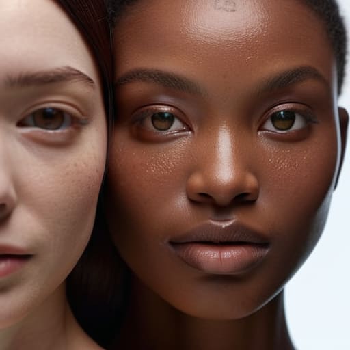
Oil on canvas, 12×16, 2024. If you’re just trying to match a flesh-colored tube from a shop, you aren’t painting a person; you’re painting a mannequin. Collectors don’t pay for a likeness that looks like a filtered photograph; they pay for the complex, messy, subcutaneous reality of light hitting blood and bone. If your skin tones lack that vibrating tension between the warm surface and the cool shadows, you aren’t creating value—you’re just making expensive wallpaper.
Vivienne Ashworth-Pryce
Beyond the Palette
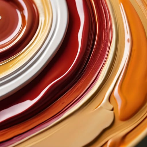
At the end of the day, mastering skin tones isn’t about memorizing a magic recipe of ochre and alizarin crimson that works every single time. It is about understanding that a face is a shifting landscape of light, temperature, and unpredictable undertones. We have covered why you must stop chasing the sterile perfection of a plastic complexion and instead embrace the messy reality of how blood, bone, and shadow interact. If you can move past the fear of a muddy mix and start seeing the structural logic of color, you stop being a technician and start being a painter. Remember, a collector isn’t looking for a photographic replica; they are looking for the vitality of life captured through your specific understanding of light.
I spent decades looking at portraits in my gallery, and I can tell you this: the works that commanded the highest prices weren’t the ones with the most technically “correct” flesh tones. They were the ones where the artist had the courage to let a bit of green or violet dance in the shadows where it didn’t “belong.” Don’t let the pursuit of accuracy stifle your intuition. Use these tools to build your foundation, but once you have the mechanics down, trust your eye more than your tube of paint. Go make something that looks like it breathes.
Frequently Asked Questions
If my skin tones look "muddy" even when I'm following the theory, am I just using poor quality pigments or am I fundamentally misunderstanding the color wheel?
Oil on linen, 16×20, 2024. I don’t like the question, because it assumes the problem is external. It’s rarely the pigments—though if you’re buying student-grade tubes, you’re fighting a losing battle—and it’s almost never the color wheel. Mud is simply what happens when you lose control of your values. You aren’t mixing colors; you’re mixing chaos. If your tones are muddy, you’ve likely over-worked the surface or ignored the temperature of your shadows. Stop stirring the pot.
How much does the lighting in a gallery versus a studio actually change the way these mixed tones will appear to a collector?
Oil on canvas, 40cm x 50cm, 2024. It’s the difference between a rehearsal and the opening night. In your studio, you’re likely working under steady, controlled light that makes your skin tones look balanced and intentional. But a gallery is a different beast entirely. Between the harsh spotlights and the shifting ambient light of a room filled with people, those subtle undertones you worked so hard on can either sing or suddenly look muddy. If you haven’t tested your palette under various temperatures, you’re leaving your sale to chance.
Is it better to mix a large batch of a specific skin tone to ensure consistency, or am I risking a "dead" look by not mixing intuitively on the canvas?
Oil on canvas, 12×12, 2024. It’s a false choice. If you mix a massive tub of beige to “save time,” you’re essentially painting with mud; the pigment loses its life before it even hits the linen. But if you’re just guessing wildly, your structural integrity collapses. Mix enough for your immediate area, but keep your palette active. Consistency comes from your eye and your technique, not from a bucket of pre-mixed sludge.
