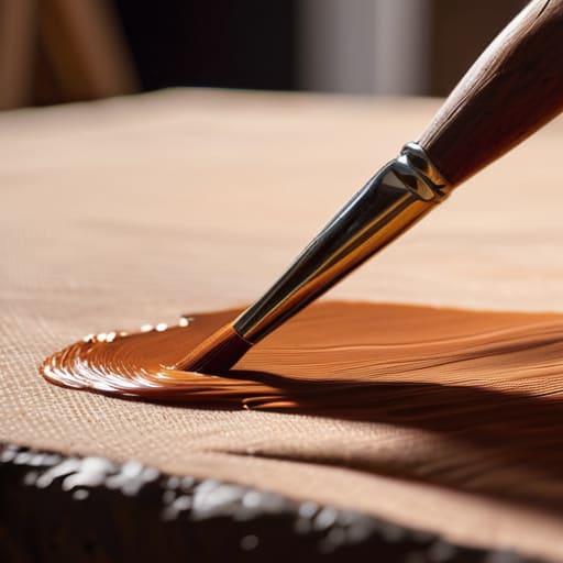

I remember standing in the back of a crowded exhibition in the late nineties, staring at a landscape that cost more than my first car. The artist was explaining the “spiritual depth” of his process, but as I leaned in, I could see the structural failure: the colors were muddy, the light was flat, and the whole composition felt like it was sliding off the canvas. He hadn’t understood how underpainting works; he had simply treated it like a decorative suggestion rather than the structural debt every serious painting must pay upfront. Most people in this industry will try to sell you a mystical narrative about “layers of soul,” but the truth is much more mechanical and much more vital.
I’m not here to talk to you about the romance of the brush; I’m here to talk about the architecture of a saleable piece. In this guide, I’m going to strip away the academic nonsense and explain the actual mechanics of building a painting from the ground up. We are going to look at how a proper foundation prevents your final layers from collapsing under their own weight, ensuring your work has the visual integrity that collectors actually notice when they stand in front of it.
Mastering Tonal Values in Painting Before the First Glaze
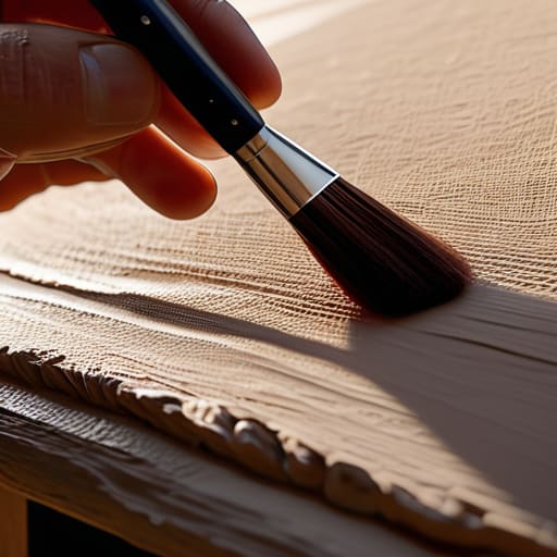
If you want to understand why some paintings look like they’re glowing from within while others look like flat, muddy accidents, you have to stop obsessing over the “perfect” blue and start looking at your light. Most artists I advised used to jump straight into the drama of color, only to realize halfway through that their composition had the structural integrity of a wet biscuit. This is where you master tonal values in painting before you ever touch a tube of expensive pigment. Think of your underpainting as the architectural blueprint; if the shadows aren’t placed correctly now, no amount of expensive cadmium red is going to save the final piece.
I always told my artists that a successful monochromatic underpainting isn’t about being “pretty”—it’s about establishing the weight of the objects. You are essentially mapping out the logic of the light. By utilizing monochromatic painting methods early on, you strip away the distraction of hue and force yourself to confront the actual geometry of the scene. You aren’t just laying down paint; you are building the scaffolding that will eventually support the heavy lifting of your final layers.
Why Building Depth in Fine Art Starts Beneath the Surface
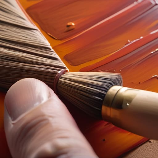
I spent twenty-six years watching collectors stand in front of canvases, squinting as if they could sense something missing. They usually can. They’re sensing a lack of dimension, that frustratingly flat quality that occurs when an artist tries to force color to do all the heavy lifting. You cannot simply slap a vibrant cadmium red over a white primed surface and expect it to sing; it will just look like paint on a wall. True building depth in fine art isn’t about the pigment you see at the end; it’s about the structural integrity you establish in the shadows.
When you utilize proper oil painting layering techniques, you aren’t just adding more “stuff” to the canvas. You are managing light. An underpainting acts as a reservoir for light to bounce through, traveling from the base layers back through the translucent glazes to the eye. If you skip this, you’re essentially trying to build a house without a foundation and wondering why the walls look thin. You aren’t just painting a subject; you are engineering a way for light to inhabit the work.
The Invisible Investment
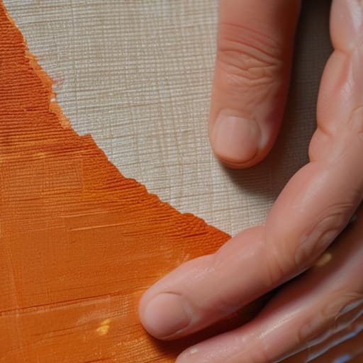
Most artists view underpainting as an optional extra or a tedious chore, but in my experience, it’s actually the structural debt you pay upfront; if you don’t settle your tonal values early, you’ll spend the rest of the painting trying to fix a collapse that was inevitable from the first stroke.
Vivienne Ashworth-Pryce
The Long Game of the Canvas
At the end of the day, underpainting isn’t some mystical, esoteric ritual reserved for the Old Masters; it is simply the structural debt you pay upfront so your final layers don’t collapse under their own weight. We’ve talked about establishing those crucial tonal values and why depth is won or lost before you even touch a glaze. If you skip this stage, you aren’t being efficient—you are just building a house on sand. You might get away with it on a small, decorative piece, but if you want to create work that holds up under the scrutiny of a collector or the harsh light of a gallery, you have to respect the foundation.
I spent twenty-six years looking at thousands of canvases, and I can tell you that the ones that truly stop a person in their tracks are rarely the ones with the most expensive pigments or the most intricate details. They are the ones where the light seems to come from within the surface, rather than just sitting on top of it. That internal light is the direct result of the work you do when no one is watching—the messy, monochromatic, often frustrating work of the underpainting. Don’t rush the process just to get to the “pretty” part. Build it right the first time, and the work will eventually do the heavy lifting for you.
Frequently Asked Questions
If I’m spending all this time on an underpainting, am I just doubling my material costs and wasting time that could be spent on the final layers?
Oil on linen, 24×30, 2024. You’re asking if you’re burning money and hours on a foundation that no one will ever see. The short answer is no. If you skip the underpainting, you aren’t saving time; you’re just deferring the struggle to your final layers, where it’s much harder to fix a structural mistake. Think of it as an investment in efficiency. A solid tonal map means you spend less time guessing and more time executing.
How do I know if my underpainting is actually helping the depth or if I’ve just created a muddy mess that’s going to ruin my final colors?
Oil on linen, 16×20, 2024. It’s a fair question, and a common one. You’ll know you’ve succeeded when your final layers look luminous rather than heavy. If you can see the “glow” of the light through your top colors, the underpainting is doing its job. If the colors look flat, dull, or—as you feared—muddy, you’ve likely over-worked the surface or used too much dark pigment. Stop scrubbing and let it breathe.
Is it better to go with a traditional monochromatic wash, or is there any real business case for using a more complex color block underneath?
Oil on linen, 24×30, 2024. Listen, the monochromatic wash is your reliable, low-overhead baseline. It’s efficient. But if you’re looking for a business case for complex color blocking, it’s this: optical vibration. A sophisticated color block underneath creates a luminosity that a simple wash can’t touch. Collectors don’t just buy a subject; they buy the way light behaves on the surface. If you want to justify a higher price point, give them that depth.
