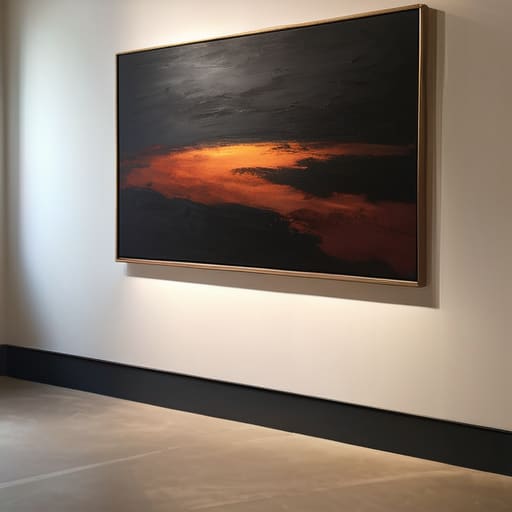

I remember a particular Tuesday in my old gallery, standing in front of a stunning, large-scale oil on linen from 2014, watching a serious collector squint at a canvas that should have been breathtaking. The problem wasn’t the brushwork or the composition; it was a cheap, warm-toned halogen bulb positioned just far enough away to create a muddy glare right where the texture should have sung. People love to treat lighting like some esoteric, high-concept magic trick, but the truth about how gallery lighting works is far less mystical and far more mechanical. If a gallery is dimming the lights to “set a mood,” they aren’t being atmospheric—they are often just hiding a mediocre collection or masking a fundamental lack of technical knowledge.
I have no interest in selling you on expensive, designer fixtures that do nothing but eat your profit margins. Instead, I’m going to pull back the curtain on the actual physics and the unspoken etiquette of illumination. I will tell you exactly how to choose color temperatures that don’t turn your vibrant blues into sludge, how to position spots to highlight texture without creating a distracting glare, and how to ensure your work looks as expensive as it actually is.
The Color Rendering Index Cri Why Cheap Bulbs Kill Your Commission
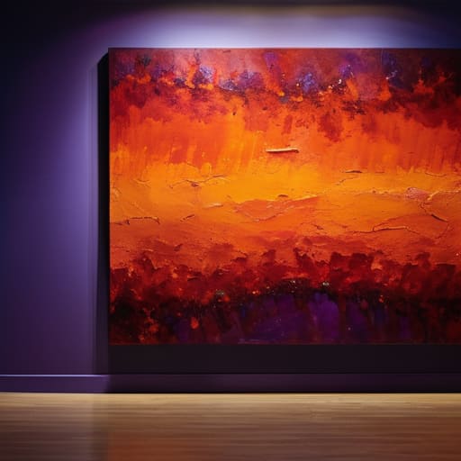
Let’s get one thing straight: a painting that looks spectacular in your studio can look like a muddy disaster in a poorly lit gallery. This isn’t a matter of taste; it’s physics. Most amateur setups rely on cheap, generic bulbs that fail the most basic test of professional display: the color rendering index CRI. If a gallery is using lights with a low CRI, they are effectively stripping the soul out of your palette. You might have spent weeks perfecting a specific, bruised violet or a delicate ochre, only to have it rendered as a flat, sickly grey because the light source lacks the spectral range to actually show those colors to the buyer.
When I was running my gallery, I didn’t care how much a lighting fixture cost; I cared about the light it threw. If a dealer tells you they have “mood lighting” but they aren’t using high-CRI bulbs, they are essentially asking you to subsidize their electricity bill with your reputation. High-quality accent lighting for artwork is non-negotiable because it ensures that what the collector sees is exactly what you intended. If the light is lying to the customer, the sale will eventually fail, and you’ll be the one left dealing with the return.
Mastering Light Intensity and Lux Levels to Command Attention
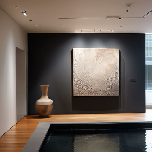
If you walk into a gallery and feel like you’re squinting to find the subject, the dealer has failed you. Most beginners think “more light” equals “better visibility,” but that is a fast track to a flat, washed-out exhibition. You aren’t just trying to see the paint; you are trying to direct the viewer’s eye. This is where light intensity and lux levels become your most subtle sales tool. A painting sitting in a pool of uniform brightness is just furniture. A painting hit with precise accent lighting for artwork becomes an event.
The goal is to create a hierarchy of importance. You want the viewer to feel a physical pull toward the canvas, which requires a deliberate contrast between the illuminated work and the surrounding space. However, there is a fine line between drama and a glare that makes a collector want to walk out the door. If your track lighting systems are aimed poorly, you’ll end up with hot spots on the varnish that make the work look cheap and amateurish. You want the light to feel like it is emanating from the piece, not just hitting it from the ceiling.
The Cost of Bad Shadows
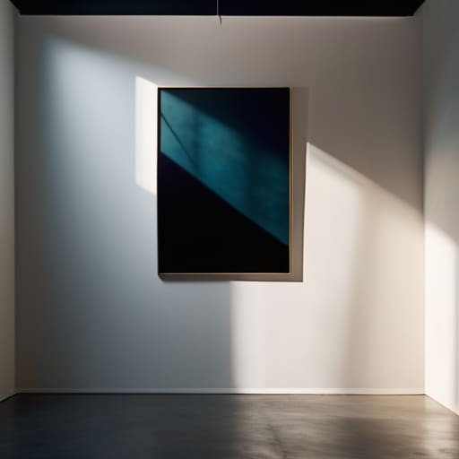
If a gallery is dimming the lights to create ‘atmosphere’ while your canvases are drowning in muddy shadows, they aren’t being moody—they are being lazy, and they are effectively devaluing your work before a collector even reaches the frame.
Vivienne Ashworth-Pryce
The Bottom Line on Illumination
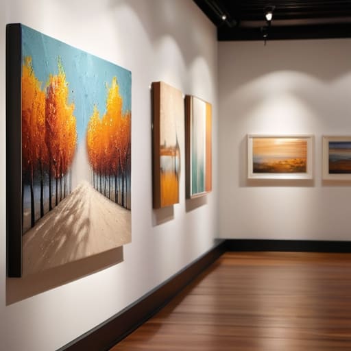
At the end of the day, lighting is not a decorative afterthought; it is a fundamental tool of the trade that bridges the gap between a piece of canvas and a piece of investment. We have discussed why a high CRI is non-negotiable for color accuracy and why improper lux levels can either wash out your hard work or leave it lurking in a corner like a shameful secret. If you are an artist, stop letting a gallery treat lighting as a utility bill to be minimized. If you are a collector, remember that if a piece looks muddy or lifeless under the spotlights, it isn’t the painting’s fault—it’s a failure of the environment. Lighting is the silent salesperson, and when it’s done poorly, it’s actively sabotaging your ability to close a sale.
I spent twenty-six years watching beautiful, expensive works lose their soul because someone decided to save a few pounds on dimmers or cheap LEDs. Don’t let that be your story. Use this knowledge to demand better, to advocate for your work, and to ensure that when a buyer stands in front of your piece, they are seeing exactly what you intended them to see. You have spent countless hours fighting for your vision; do not let a poorly placed bulb steal your commission or diminish your legacy. Light your work with intention, or don’t bother showing it at all.
Frequently Asked Questions
If my studio lighting is decent, can I just get away with using standard track lights in my home studio, or am I sabotaging my own sales?
Oil on canvas, 40cm x 40cm, 2024. I don’t like the idea that you’re settling.
How do I know if a gallery is actually using professional-grade lighting or if they're just pointing cheap spotlights at my canvases to make them look better than they are?
Look at the shadows, not the glow. If the light is hitting your canvas at a sharp, aggressive angle that creates a hot spot in the center and leaves the edges in gloom, they’re using cheap, directional spots to mask a poorly lit room. Professional setups use diffused, layered lighting. If you can see the individual “pools” of light on the floor or walls, they aren’t curating an environment; they’re just pointing flashlights.
Is there a specific way to light different textures—like heavy impasto versus delicate watercolors—without creating distracting shadows or washing out the detail?
Oil on canvas, 40cm x 50cm, 2024. If you’re dealing with heavy impasto, you need raking light—positioning your sources at an angle to catch those ridges. But be careful; too much angle creates shadows that look like dirt. For watercolors, you want the opposite: flat, diffused light. You want to illuminate the paper’s grain without making the pigment look like it’s sitting on top of a window. Don’t let a bad shadow devalue your texture.
