

Stop looking for a hidden map or a secret code in a splatter of cobalt blue; you aren’t solving a riddle, and quite frankly, the artist probably didn’t leave one for you to find. I spent twenty-six years watching collectors stand in front of canvases with their brows furrowed, desperately trying to figure out how to read abstract work as if it were a technical manual for a washing machine. They think if they can just identify the “subject,” they’ve won. That is a lie, and it’s a lie that makes the art world feel much more exclusive and intimidating than it actually is.
I am not here to teach you some esoteric, academic nonsense that requires a PhD to decipher. Instead, I’m going to tell you what actually happens when you stand in front of a piece that has no recognizable shape. I will show you how to look at composition, weight, and intent to decide if a painting is worth your hard-earned money. This isn’t about finding a “meaning”—it’s about deciding if the visual energy is worth the price tag.
Interpreting Non Representational Art Through a Collectors Lens
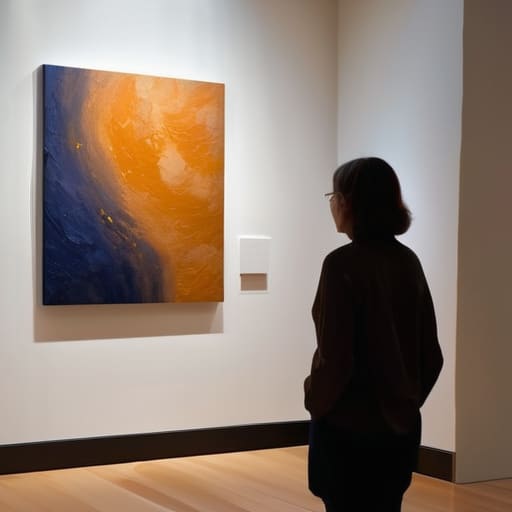
When you’re standing in front of a canvas that refuses to show you a tree or a face, the instinct is to panic and look for a secret code. Stop that. You aren’t a cryptographer, and the artist isn’t playing a prank on you. When interpreting non-representational art, you have to stop asking “what is this?” and start asking “what is this doing to me?” A collector isn’t buying a literal depiction of a landscape; they are buying a specific, captured frequency. If the work makes you feel restless, or perhaps strangely settled, that isn’t a failure of your intellect—it’s the work performing its primary function.
Focus your attention on the visual elements in abstract composition rather than a search for hidden symbols. Look at how a jagged line cuts through a field of soft wash, or how a heavy impasto texture creates a physical weight that demands space in a room. Understanding color theory in art is helpful, certainly, but don’t get bogged down in textbooks. I’ve seen collectors spend twenty minutes debating the “meaning” of a blue square when they should have been noticing how the sheer scale of the pigment changes the temperature of the entire room.
Visual Elements in Abstract Composition the Real Value Drivers

When I’m standing in a room with a potential buyer, I stop talking about “feelings” and start talking about physics. Most people approach interpreting non-representational art as if they’re trying to decode a secret message from a ghost, but the reality is much more tactile. You have to look at the tension. Is the brushwork frantic and thin, or is there a deliberate, heavy impasto that demands space? I tell my clients to look for the structural integrity of the piece. If a composition feels like it’s collapsing into a corner or lacks a focal anchor, it’s often because the artist hasn’t mastered the balance between chaos and control.
Then there is the matter of color. Forget the textbook definitions of understanding color theory in art; in a commercial setting, color is about weight and temperature. A large-scale canvas dominated by high-chroma reds will physically command a room differently than a muted, atmospheric wash of ochre. Collectors aren’t just buying a pigment; they are buying how that pigment manipulates the light in their specific hallway or study. If the color feels accidental rather than intentional, the value drops instantly in my eyes.
Stop Hunting for Meaning

Stop treating an abstract painting like a riddle you need to solve or a secret code left behind by a genius; you aren’t looking for a hidden map, you are deciding if the visual tension and the weight of the pigment are worth the space they will occupy on your wall.
Vivienne Ashworth-Pryce
The Final Frame

At the end of the day, reading an abstract piece isn’t about performing an autopsy on the artist’s psyche or finding a secret code hidden in a brushstroke. It is about recognizing that the value lies in the tension between the formal elements—the scale, the texture, the way a specific pigment interacts with light—and your own visceral reaction to them. You aren’t looking for a map; you are looking for a resonance. When you stop trying to “solve” the painting and start evaluating how its composition dictates the energy of a room, you move from being a confused spectator to an informed collector.
Don’t let the lack of a recognizable subject make you feel like you’re missing the point. The most profound works often bypass the intellect entirely to strike something deeper, something more primal. Whether a piece is a chaotic explosion of color or a quiet, minimalist study in tone, its success is measured by its ability to hold your attention long after you’ve walked away from the easel. Buy the work that makes you feel something uncomfortable or undeniable, and remember: if you have to ask if it’s “good,” you probably haven’t looked closely enough at what it’s actually doing to you.
Frequently Asked Questions
If there is no recognizable subject, how do I know if I'm being "tricked" by a piece that is actually just decorative?
Oil on canvas, 40x40cm, 2023. It’s a valid fear. Here is the distinction: decoration is designed to disappear into a room; good abstraction demands you look at it. If the work relies entirely on a “pretty” color palette to do the heavy lifting, it’s probably just wallpaper. Look for intentionality in the marks. If the composition feels resolved—even if it’s chaotic—it’s art. If it feels like a random accident, it’s decor.
How much does the artist's written statement actually matter versus what the canvas is doing on its own?
Oil on canvas, 40×40, 2023. If the work is doing its job, the statement should be an appendix, not a manual. I’ve seen brilliant paintings rendered mediocre by a wall of pretentious, academic jargon, and I’ve seen “concept-heavy” work that falls apart the moment you stop reading the plaque. A statement should provide context, not a crutch. If you need three paragraphs of text to justify a smudge of ochre, the smudge isn’t working.
At what point does "emotional response" stop being a valid way to judge quality and start being a way to justify overpaying?
Oil on canvas, 40×40, 2023. It’s a dangerous question. Emotion is the hook, but it shouldn’t be the anchor. An emotional response is valid when it’s a reaction to the artist’s technical mastery—the way a specific tension in a line or a particular weight of color forces that feeling upon you. It becomes a justification for overpaying the moment you use “I just feel it” to bypass the question of whether the work actually holds up under scrutiny.
