

I once watched a very wealthy, very influential collector spend forty-five minutes trying to decide where to place a small, exquisite oil on copper—12cm by 8cm, 2018—only to end up hanging it nearly two feet above his mantelpiece. It was a tragedy. Most people treat their walls like a game of Tetris, just trying to fill a void, but they fail to realize that how to hang art at home is less about geometry and more about intent. If you treat a piece like an afterthought, you are essentially telling the viewer that the work itself is an afterthought, and in my experience, a collector will sniff out that lack of respect in a heartbeat.
In this guide, I’m stripping away the pretension and the “designer” nonsense to give you the actual mechanics of curation. I won’t be talking about color palettes or matching your throw pillows; instead, I’m going to teach you how to command a room using scale, lighting, and eye level. You will learn exactly how to avoid the amateur mistakes that devalue your collection and, more importantly, how to ensure your work actually breathes.
Guide Overview
Tools & Supplies
- Measuring tape for determining placement and spacing
- Pencil for marking drill or nail points
- Hammer for driving nails or picture hooks
- Level to ensure art is perfectly straight
- Power drill for heavy frames or drywall anchors
- Picture hanging hardware (hooks, nails, or anchors) 1 pack
- Wall adhesive strips (for no-drill options) 1 pack
- Painter's tape for marking layout on walls 1 roll
Step-by-Step Instructions
- 1. First, stop treating your walls like a storage unit for things you bought on impulse. Before you even pick up a hammer, you need to scout the light. I’ve seen collectors ruin a magnificent oil painting by hanging it directly opposite a window where the afternoon sun will bleach the pigments within three years. You want the work to be seen, not interrogated by glare. Walk the room at different times of day to see how the shadows fall; if the light is harsh, move the piece.
- 2. Next, find your “anchor.” Most people wander around a room like lost tourists, trying to find a spot for a piece, rather than letting the architecture dictate the placement. Look for the natural focal points—above a sideboard, flanking a fireplace, or centered over a sofa. A common mistake is hanging a small, delicate work in the middle of a massive, cavernous wall; it looks lonely and accidental. You want the work to feel like it has a permanent residence, not like it’s just visiting.
- 3. Now, let’s talk about height, because this is where most amateurs fail. The golden rule is to hang the center of the work at eye level—roughly 57 to 60 inches from the floor. I know, it sounds clinical, but it works because it respects the viewer’s natural gaze. If you’re hanging a piece above a piece of furniture, don’t let it float toward the ceiling like a lost balloon. It should feel connected to the furniture, usually about six to eight inches above the top edge of the sofa or console.
- 4. Before you drive a single nail into the plaster, use painter’s tape or paper templates. I cannot stress this enough. Trace the dimensions of your frame onto some butcher paper, cut it out, and tape it to the wall. This allows you to step back, look at the scale, and realize that the piece you thought was “statement-sized” is actually quite uncomfortably small for that specific hallway. It is much cheaper to move a piece of paper than it is to patch a hole in a rented apartment or a high-end plastered wall.
- 5. Check your hardware. If you are hanging a heavy, framed bronze or a large-scale canvas, do not trust those flimsy little wire hooks you find in a junk drawer. Use a proper wall anchor or find a stud. I’ve had too many artists and collectors face the heartbreak of a shattered frame because they tried to save five dollars on mounting hardware. If the work has weight, the hardware must have the integrity to match it.
- 6. Finally, curate the grouping. If you are hanging a series or a collection of smaller works, treat them as a single visual unit. Don’t scatter them around the room like confetti; group them so they create a cohesive narrative. Keep the spacing between frames consistent—about two to three inches is usually the sweet spot. If the spacing is erratic, the eye gets distracted by the gaps rather than being drawn into the art itself. You want the viewer to see the conversation between the pieces, not the struggle to align them.
Mastering Eye Level Hanging Height Like a Professional Curator

Most people approach a blank wall with a level and a prayer, but they almost always miss the mark. When I was running my gallery, we didn’t just aim for the middle of the wall; we aimed for the center of the viewer. The golden rule is to position the center of the piece at roughly 57 to 60 inches from the floor. This is the standard eye level hanging height used in professional institutions, and for good reason. If you hang a piece too high—a common mistake in homes with soaring ceilings—you aren’t showcasing the work; you’re forcing the viewer to crane their neck like they’re looking at a billboard. You want the art to meet the person, not loom over them.
Now, don’t get sloppy with the mechanics. If you are working with a substantial piece, don’t even think about command strips vs nails; you need proper wall mounting hardware types that can actually handle the load. There is nothing that kills the prestige of a beautiful oil painting faster than a slow, agonizing tilt because the hardware was too flimsy for the frame. If you’re attempting to manage several smaller works, treat your gallery wall layout ideas with the same rigor you’d give a solo exhibition. It’s about intentionality, not just filling gaps.
The Truth About Gallery Wall Layout Ideas and Interior Design Art Placement
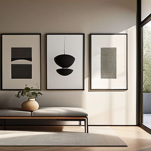
Now, let’s talk about the impulse to clutter. I see it all the time: an artist or a well-meaning collector tries to execute one of those Pinterest-perfect gallery wall layout ideas, resulting in a visual migraine that makes the individual pieces look like they’re fighting for survival. If you are going to go the multi-piece route, you must treat the collection as a single, cohesive unit. Don’t just scatter frames; define a boundary. Whether you’re grouping by scale or color, the spacing between the frames must be disciplined. If the gaps are inconsistent, the whole arrangement looks accidental rather than intentional, and nothing kills the perceived value of a piece faster than sloppy curation.
When it comes to interior design art placement, you also need to consider the furniture beneath the work. A common mistake is hanging a stunning landscape too high above a sideboard, leaving a “dead zone” of empty wall that makes the art look like it’s floating away. The art should feel anchored to the room, not hovering in a vacuum. And for heaven’s sake, stop relying on temporary adhesives for anything substantial. If you’re hanging heavy frames, use the proper hardware; a fallen masterpiece is a tragedy no one recovers from gracefully.
The Cost of Lazy Placement
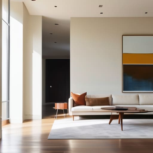
If you hang a piece of work just to fill a void, you aren’t decorating; you’re apologizing for the space. A collector doesn’t buy a painting to have it ‘sit’ on a wall—they buy it to command a room, and if your placement is hesitant, the work loses its authority before the buyer even reaches for their checkbook.
Vivienne Ashworth-Pryce
Stop Treating Your Walls Like Afterthoughts
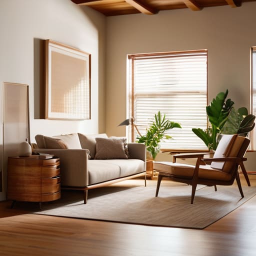
At the end of the day, hanging art is about more than just finding a hammer and a level. We have covered the technicalities—from the non-negotiable rule of eye level to the architectural logic of a well-planned gallery wall—but the goal isn’t to replicate a sterile museum environment. It is about ensuring that when a guest walks into your room, the art feels like it belongs there, rather than looking like it was simply stuck on to fill a void. If you respect the scale, mind the lighting, and avoid the amateur mistake of cluttering your visual field, you stop being someone who just owns things and start becoming someone who curates a life.
Don’t let the fear of making a mistake keep your best pieces tucked away in a crate in the garage. I spent twenty-six years watching collectors hesitate, waiting for the “perfect” moment to commit, only to realize that the most impactful spaces are the ones that feel lived-in and intentional. Your home is not a showroom, and it certainly isn’t a showroom for a gallery that doesn’t care about you. It is your sanctuary. Hang that piece, even if the placement feels a bit daring, because the connection between the viewer and the work is the only thing that actually matters in the long run.
Frequently Asked Questions
If I’m working with a massive, heavy-framed piece, can I actually trust a standard wall plug, or am I asking for a disaster?
Oil on canvas, 120cm x 150cm, 2024. If that’s what we’re talking about, then no, you cannot trust a standard plastic wall plug. You aren’t just hanging a picture; you’re hanging a liability. For anything substantial, you need to go into the stud or use heavy-duty masonry anchors. I’ve seen far too many beautiful, expensive works end up face-down on a hardwood floor because an artist—or a collector—got lazy with the hardware. Don’t risk it.
How do I handle art that doesn't fit my existing decor without making the whole room look like a mismatched thrift store?
Oil on canvas, 40x50cm, 2023. It’s a bold piece, but you’re terrified it’ll clash with your beige sofa. Listen, a room shouldn’t look like a showroom catalog; it should look lived-in. If the colors fight, use a “buffer”—a frame in a neutral tone or a nearby object that pulls a minor pigment from the art. Don’t try to force harmony; aim for intentional tension. If it looks like a mistake, it’s because you haven’t given it room to breathe.
Is it a mistake to hang art in a hallway or a narrow corridor where the lighting is terrible and the traffic is high?
Oil on canvas, 40cm x 30cm, 2023. I hate it when people treat their hallways like a dumping ground for leftover pieces. If the lighting is abysmal and the corridor is a high-traffic thoroughfare, you aren’t displaying art; you’re just creating a tripping hazard. A collector wants to linger, not rush past a dim, scuffed frame. If you can’t fix the light, save the work for a room that actually deserves it.
