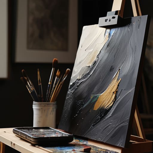

I remember sitting in my back office twenty years ago, staring at a digital file sent by a promising painter that looked more like a blurry smudge of grey than a vibrant oil on canvas. He had spent three months on the piece and three minutes on the photo, and quite frankly, he’d just thrown money away. There is this ridiculous, expensive myth floating around that you need a studio filled with lighting rigs and a degree in technical photography to succeed, but that’s nonsense. The truth is, if you don’t master how to photograph your own work, you are essentially asking collectors to buy a mystery box rather than a masterpiece.
I am not here to sell you a thousand-pound camera or a complicated manual on aperture settings. Instead, I’m going to give you the unvarnished truth about what actually works when you’re working from a spare bedroom or a drafty studio. I will show you how to capture the true color, texture, and scale of your pieces using nothing more than common sense and a bit of patience. We are going to strip away the technical jargon and focus on one thing: making sure your digital image does your physical labor justice.
Mastering Studio Lighting for Artists to Protect Your Value
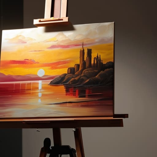
Stop treating your lighting like an afterthought. I have seen far too many talented painters lose a sale because their work arrived looking like a muddy, yellowed mess that bore no resemblance to the piece sitting on the easel. When you are investing in studio lighting for artists, you aren’t just buying lamps; you are buying the ability to communicate truth. If your light source is inconsistent or, heaven forbid, comes from a single overhead bulb, you create hot spots and deep, unflattering shadows that kill the dimension of your brushwork.
You must prioritize color accuracy in art photos above all else. A collector needs to know that the cerulean they see on their screen is the same cerulean that will arrive in their living room. If your white balance is off, you aren’t just showing a bad photo; you are actively eroding the trust required for a high-value transaction. If you work with heavy impasto or mixed media, you’ll eventually need to master macro photography for textures to show the physical reality of the surface, but even then, it only works if your light is steady, neutral, and honest.
The Truth About Color Accuracy in Art Photos
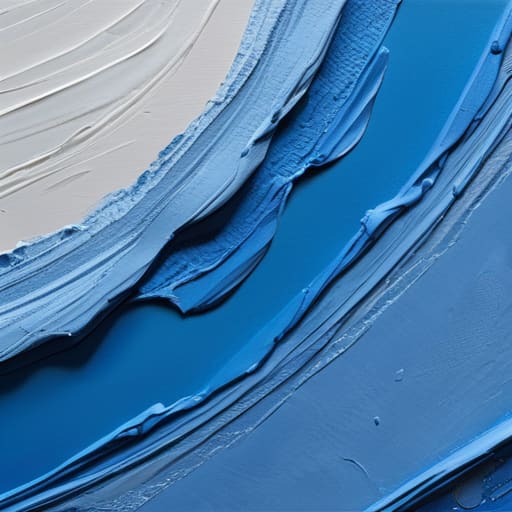
Here is the hard truth: if a collector receives a piece and the cerulean blue looks like a muddy navy, you haven’t just made a mistake; you’ve broken a contract of trust. I have sat in my gallery many times, watching a buyer’s face fall when the physical reality of a painting failed to match the digital promise. Achieving true color accuracy in art photos is not about making the work look “pretty”—it is about making it look honest.
You cannot rely on your eyes alone, because your brain is a liar; it constantly compensates for the warmth of your studio lamps or the blue tint of a cloudy afternoon. To combat this, you must use a neutral grey card or a color checker in your frame. If you aren’t adjusting your white balance based on a physical reference, you are essentially guessing. I have seen far too many talented painters lose sales simply because their digital files were chromatically deceptive. In this business, your reputation is built on the gap between the screen and the canvas being as small as humanly possible.
The Cost of a Bad Photograph
I have seen magnificent, soul-stirring canvases lose their value before a collector even reaches for their wallet, all because the lighting made the work look flat and the colors look muddy. You can be the most talented painter in the county, but if your photography is amateur, you are signaling to the market that your practice is amateur too—and I promise you, nobody is going to pay premium prices for a first impression that looks like it was taken on a burner phone in a basement.
Vivienne Ashworth-Pryce
The Bottom Line on Your Digital Presence
At the end of the day, photographing your work isn’t about becoming a professional photographer; it’s about removing the friction between your vision and a collector’s eye. We have covered the necessity of controlled lighting to avoid those hideous, distracting glares, and the absolute non-negotiable requirement of color accuracy. If a collector buys a piece online and the blues arrive looking like muddy greens, you haven’t just lost a sale; you’ve lost a relationship. You cannot afford to let technical laziness undermine the years of labor you poured into the canvas itself.
Please understand that in this market, your digital file is often the only version of your work that exists in the world. It is your handshake, your storefront, and your primary tool for building value. Do not treat this as a chore to be rushed through in a dark corner of your studio. Approach your documentation with the same rigor and respect that you bring to your actual practice. You are not just taking a picture; you are translating your soul into a medium that can be shared, bought, and cherished. Treat your images with the dignity your art deserves, and the market will eventually follow suit.
Frequently Asked Questions
If I can't afford a professional photographer or a high-end DSLR, is a modern smartphone actually good enough to represent my work to a gallery?
Oil on canvas, 40cm x 40cm, 2024. Honestly? Yes, it is. If you have a steady hand, a bit of patience, and enough natural light, a modern smartphone is more than capable. I’ve seen professional shots that look sterile and lifeless, and then I’ve seen iPhone captures that actually convey the texture of the impasto. Just don’t get lazy. If you use a phone, you must master the lighting, or you’re just making excuses for poor presentation.
How much time and effort should I realistically spend on post-production editing before it starts looking "fake" or deceptive to a collector?
Oil on canvas, 30 x 40 inches, 2024. I like it, but only if it looks like it actually exists in three dimensions. Look, editing is for correcting, not creating. If you’re spending hours smoothing out brushstrokes or adjusting shadows to make a piece look “cleaner,” you’re lying to the collector. The moment a buyer receives a piece that looks different from the screen, you’ve lost their trust—and your reputation. Stop polishing; start documenting.
Should I be photographing my work in situ—hanging on a wall in a nice room—or is it better to keep everything strictly on a neutral, clean background?
Oil on canvas, 60x80cm, 2024. I like the question. Here is the truth: you need both. The clean, neutral shot is your professional baseline; it’s what a cataloger or a gallery needs to see the work without distractions. But the “in situ” shot? That is your sales tool. It helps a collector visualize the scale and the mood in their own home. One proves the work exists; the other makes them want to own it.
