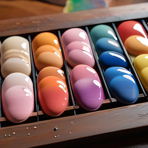

I remember sitting in the back of a dusty studio in 1994, watching a young painter attempt to justify a four-figure price tag on a series of works that looked suspiciously like failed watercolors. He was trying to lecture a collector on the “mystical layering properties” of his medium, but any seasoned eye could see he hadn’t actually mastered how gouache is used to create stable, velvety opacity. He was hiding behind the medium’s temperamental nature rather than commanding it. It’s a common trap: treating a specific technical challenge as if it were some profound, intentional stylistic choice, when in reality, you’re just struggling with the pigment.
I have no interest in romanticizing the struggle or selling you a dream of effortless mastery. What I am going to give you is a pragmatic breakdown of the mechanics—the actual, unglamorous reality of how to control this stubborn, matte beast so that your work looks intentional rather than accidental. We are going to strip away the pretension and look at the technical truth of the medium, from water ratios to drying times, so you can stop fighting your tools and start making work that actually holds its value.
Mastering Water Based Medium Properties for Professional Results
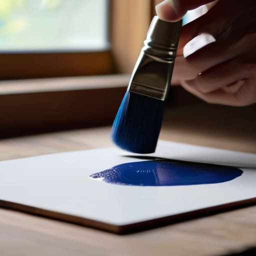
If you treat gouache like a simplified version of watercolor, you are going to have a very expensive, very frustrating afternoon. The fundamental water-based medium properties here demand a different kind of discipline; while watercolor relies on the luminosity of the paper shining through, gouache is about the pigment sitting on top of it. To achieve professional results, you have to master opaque paint application techniques that allow for correction without the muddy, greyish mess that happens when a novice tries to scrub out a mistake.
The real magic—and the real difficulty—lies in the drying process. Because it dries to a flat, velvety surface, you can achieve a stunning matte finish painting style that looks incredibly sophisticated in a frame, but you cannot afford to be indecisive. Once you lay down a heavy layer, it stays put, which is exactly why layering gouache for illustration requires a strategic approach to value and drying time. If you rush the layers while the previous one is still tacky, you aren’t creating depth; you’re just creating a muddy disaster that no collector will want to hang in their dining room.
Gouache vs Watercolor Differences the Cost of Transparency
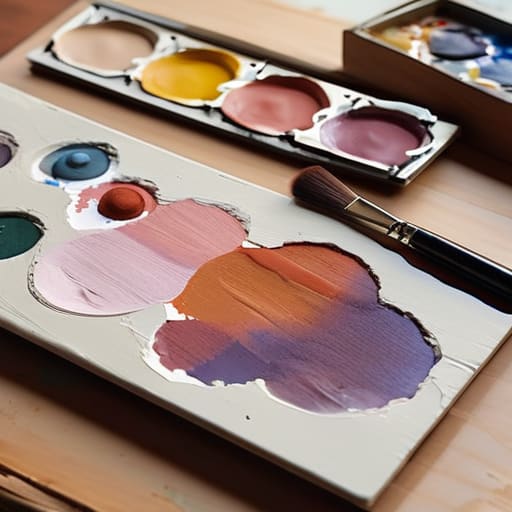
The fundamental gouache vs watercolor differences aren’t just about how much water you use; they are about how you manage light. Watercolor is a game of subtraction and light passing through pigment to hit the paper; it’s a delicate, transparent dance. Gouache, however, is an additive process. Because it is heavily pigmented and contains a higher ratio of binder, it allows for opaque paint application techniques that watercolor simply cannot touch. You aren’t just staining the paper; you are building a surface.
For an artist trying to command a professional price, this distinction is everything. If you attempt to treat gouache like a transparent wash, you’re wasting the medium’s greatest strength. The real value lies in the ability to lay a light color over a dark one—a feat that makes layering gouache for illustration so much more forgiving and structurally sound than its cousin. When you master that opacity, you aren’t just making a “pretty picture”; you are creating a controlled, velvety surface that holds its own weight in a collection.
The Gouache Trap
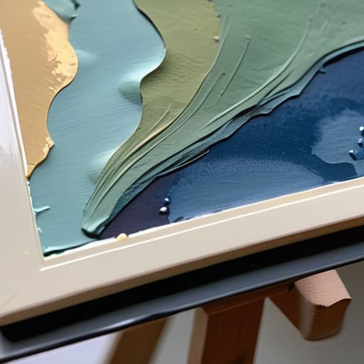
“Stop treating gouache like it’s just ‘heavy watercolor’ and start treating it like the precision instrument it is; if you’re using it to hide sloppy brushwork instead of leveraging its matte opacity to build intentional, architectural layers, you aren’t mastering a medium, you’re just making expensive mistakes that collectors can see through in a heartbeat.”
Vivienne Ashworth-Pryce
The Gouache Reality Check
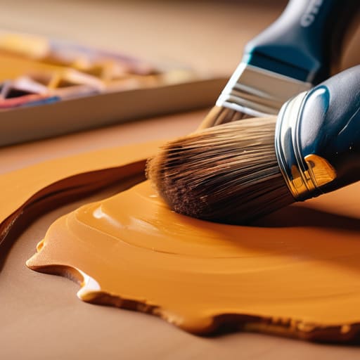
Ultimately, understanding how gouache is used means moving past the idea that it is simply a “convenient” or “student-grade” alternative to oil or watercolor. We have established that its opacity is its greatest strength, but also its most temperamental trap; if you don’t respect the drying time and the way pigment behaves when re-wet, you aren’t making art, you’re making a mess. Whether you are leveraging its matte finish for high-end illustration or using its layering capabilities to build depth that watercolor simply cannot touch, remember that technical mastery is what justifies your price tag. You aren’t just selling a pretty picture; you are selling the ability to control a stubborn, beautiful medium that most people would find utterly frustrating.
Don’t let the ease of the medium fool you into thinking the work is easy. The market is crowded with people who can dab pigment onto paper, but there is a massive, profitable gap between “hobbyist” and “professional” that is bridged entirely by intentionality and precision. Use the gouache to do what nothing else can—create those velvety, saturated surfaces that demand a collector’s attention—and then own the fact that you earned every penny of the sale. Stop treating your tools like toys and start treating them like the professional assets they are.
Frequently Asked Questions
If gouache is so temperamental, how do I justify a higher price point for my works compared to a standard watercolor piece?
You don’t justify it by talking about the paint; you justify it by talking about the control. Watercolor is a dance with chance, but gouache is a battle of intent. When you layer that opacity, you aren’t just applying pigment; you are building a surface that demands technical precision to prevent muddying. Sell the mastery required to tame that temperamental medium. Collectors aren’t just buying color; they are buying the discipline it took to command it.
How much of my final retail price should be factoring in the cost of high-grade pigments versus the sheer time spent managing the medium's drying speed?
Oil on linen, 12×12, 2024. It’s a trap to separate the two. You aren’t selling “pigment” or “time”; you are selling a finished vision. If you price based on the cost of your tubes, you’re a chemist, not an artist. If you price solely on hours, you’re a laborer. Your retail price must account for the technical difficulty of managing that temperamental drying speed. That struggle is exactly why the work is valuable.
When a collector asks why a gouache piece looks different in person than on a screen, how do I explain the technical reality of the matte finish without sounding defensive?
Don’t apologize; explain. Tell them that gouache is a pigment-heavy, matte medium that absorbs light rather than reflecting it. Digital screens use backlighting to create a luminous, saturated glow that physical paint simply cannot replicate. You aren’t selling a pixel; you’re selling the velvety, tactile depth of dried pigment. Frame it as the difference between a backlit window and a solid wall—the screen is an approximation, but the piece in their hands is the reality.
