

I remember sitting in the back of a dimly lit studio in 2004, watching a young painter struggle with a massive, textured oil on linen, 120cm x 150cm, 2004. He had spent a small fortune on professional-grade, high-tech floodlights, yet the painting looked like a muddy, lifeless mess under the glare. He was convinced that more expensive gear equaled better results, but he was fundamentally wrong about how studio lighting should be set up. Most artists I encounter are being sold a fantasy that they need a cinematic rig to be taken seriously, when in reality, they are just throwing money at a shadow problem they don’t actually understand.
I am not here to sell you a catalog of expensive lamps or peddle some high-concept lighting theory that has no bearing on a Tuesday afternoon in a drafty workspace. Instead, I’m going to tell you how to actually see your colors and textures without blinding yourself or creating a glare that makes a collector pass your work in a heartbeat. We are going to strip away the pretension and focus on the practical physics of light, ensuring your work looks exactly as it should: intentional, vibrant, and ready to be sold.
Mastering the Three Point Lighting Technique for Market Value
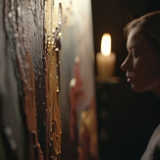
Now, let’s talk about the three-point lighting technique, and please, don’t roll your eyes at the technicality of it. I’ve sat in countless viewing rooms where a painting looked magnificent in person but appeared like a muddy, two-dimensional mess in a digital catalog. That isn’t a failure of the art; it’s a failure of physics. To avoid this, you need to understand the relationship between your key light vs fill light. Your key light provides the primary illumination, defining the texture of the paint, while the fill light steps in to soften those harsh, unforgiving shadows that can make a subtle glaze look like a dark blotch.
If you get this wrong, you aren’t just taking a bad photo; you are actively devaluing your work before a collector even asks the price. I have seen brilliant, high-value canvases rejected by buyers simply because the lighting made the colors look “off” or the surface look lifeless. Mastering controlling shadows in photography ensures that the depth of your impasto or the delicate transition of a watercolor is communicated accurately. You aren’t just “taking a picture”—you are creating a professional surrogate for the physical object.
Key Light vs Fill Light Controlling the Narrative
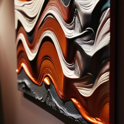
Now, let’s get practical about the hierarchy of your setup. Most artists I advise treat light like a blunt instrument—they simply turn on every lamp in the room and hope for the best. That is a mistake. In a proper key light vs fill light dynamic, your key light is the storyteller; it’s the primary source that defines the texture of your impasto or the direction of your brushwork. If you position it poorly, you aren’t just losing detail, you are losing the perceived value of the piece. A painting that looks flat because the light is hitting it head-on is a painting that looks like a print.
The fill light exists to manage the fallout. Its job isn’t to compete with the key, but to perform the delicate task of controlling shadows in photography so they don’t swallow the composition whole. You want enough shadow to provide depth and dimension—otherwise, the work lacks soul—but too much, and you’re hiding the very technical skill you’re trying to sell. It’s a balancing act. You aren’t just “lighting a canvas”; you are directing the collector’s eye to the exact moment your technique shines.
The High Cost of Bad Lighting

If your lighting is amateur, your work looks cheap—and once a collector sees a flat, lifeless image on a screen, they aren’t buying your vision, they’re passing on a bad deal. You can have the most profound technique in the world, but if you can’t translate the texture and soul of the paint into a photograph, you’re essentially invisible to the market.
Vivienne Ashworth-Pryce
The Bottom Line on Light

At the end of the day, mastering your three-point setup and understanding the delicate dance between your key and fill lights isn’t about playing with expensive gadgets; it is about protecting the integrity of your work. If you can’t translate the physical depth of a brushstroke or the subtle shift in a color field into a digital image because your lighting is flat or, worse, washed out, you are leaving money on the table. You have spent hundreds of hours perfecting the texture and the soul of a piece, so do not let a clumsy, amateur shadow be the reason a collector scrolls past your website without a second glance.
I want you to stop viewing your studio lighting as a technical chore and start seeing it as the first step in your sales process. When you present your work clearly, you aren’t just showing a picture; you are building professional trust with people who may never step foot in your studio. You are telling the market that you are a serious practitioner who respects the medium enough to document it properly. Invest the time to get the light right, because once you bridge the gap between your vision and the viewer’s screen, you stop being an enthusiast and start being a professional artist worth investing in.
Frequently Asked Questions
I’ve spent a fortune on professional lighting kits, but my work still looks flat in photos—am I missing a technical step or is it my eye?
It’s almost certainly your eye, not your equipment. You can spend five thousand pounds on Arri lights, but if you’re pointing them directly at the canvas, you’re just washing out the soul of the work. You’re fighting the texture. Stop trying to illuminate the painting and start trying to shape it. If it looks flat, you aren’t using shadows to create depth. Light isn’t just about visibility; it’s about directing the collector’s gaze.
Is it actually worth the investment to light my studio for high-end photography, or should I just pay a professional photographer to handle it?
Listen, if you have the budget for a professional, hire them. A specialist knows how to capture the soul of a texture without making it look like a clinical scan. However, if you’re constantly sending mediocre, smartphone-quality images to galleries, you’re bleeding money. Invest in decent lighting if you plan to work digitally; it’s cheaper than a bad reputation. Being able to produce a crisp, honest image on demand is a fundamental business asset.
How do I balance lighting my physical studio for my own enjoyment with the clinical, bright setup required to make a piece look "sellable" online?
Look, I get it. Working under a surgical-grade LED array is soul-crushing; it kills the mood and makes the colors look sterile. But here is the hard truth: your studio is for your process, but your lighting is for the sale. Use warm, soft light while you create—protect your psyche. But when it’s time to photograph, switch to the clinical stuff. If the digital image doesn’t match the physical reality, you’re just inviting returns and distrust.
