
I remember standing in the back of my gallery in 2004, watching a young, talented painter try to explain to a serious collector why his landscape looked more like a bruised plum than a sunset. He had spent three years mastering brushwork but hadn’t spent three minutes mastering his pigments, and frankly, the lack of chromatic depth was killing the sale. Most people will sell you a “complete guide to colour mixing” that reads like a dry chemistry textbook or a series of overpriced YouTube tutorials promising magic. They treat colour like a math equation, ignoring the fact that if your values are muddy, no amount of technical theory will save your work from looking cheap and amateurish under gallery lights.
I am not here to teach you the physics of light; I am here to teach you how to make decisions that actually hold up in a room full of buyers. This isn’t a lecture; it is a practical, no-nonsense breakdown of how to build a palette that communicates intention rather than accident. We are going to strip away the pretension and focus on the specific, messy realities of pigment interaction, so you can stop guessing and start creating work that looks as expensive as it actually is.
Mastering Color Theory Fundamentals to Command Your Market
Listen, I have sat in a thousand gallery openings and watched collectors drift past canvases that were technically proficient but visually stagnant. They aren’t looking for a lesson in schoolroom geometry; they are looking for intention. When I talk about color theory fundamentals, I’m not talking about memorizing a wheel to pass a test. I’m talking about the difference between a painting that commands a room and one that disappears into the wallpaper. If you cannot manipulate pigment saturation and value with precision, you aren’t just making a technical error—you are devaluing your own brand.
A common mistake I saw artists make during my years in the trade was an over-reliance on tube colors, leading to works that felt loud but lacked depth. If you want to move work at a serious price point, you must master the art of achieving neutral tones through intentional mixing rather than reaching for a pre-mixed grey. Collectors can sense when a palette is “cheap.” They want to see a sophisticated warm and cool color balance that suggests you aren’t just playing with paint, but actually directing the viewer’s eye through the composition.
Why Pigment Saturation and Value Dictate Your Price Point
Let’s be blunt: a collector isn’t just buying a subject; they are buying the way light behaves on your surface. When I sat in my gallery, I could tell within three seconds if a painting had “weight” or if it was merely decorative. That distinction usually comes down to how you handle pigment saturation and value. An artist who relies on heavy-handed, unmodulated color often produces work that looks flat and cheap under gallery lighting. If your values are all bunched up in the middle, you aren’t creating a window into a world; you’re just making a colorful mess that fails to command a premium price.
To move from “hobbyist” pricing to professional tiers, you must master the ability to control intensity. This means knowing exactly when to lean into those vibrant, high-chroma moments and when to pull back into achieving neutral tones that allow the eye to rest. If every inch of your canvas is screaming for attention, the viewer gets exhausted, not inspired. A sophisticated collector looks for that tension—the controlled interplay between a piercingly saturated hue and a carefully neutralized shadow. That is where the perceived value lives.
The Cost of a Muddy Palette
Stop treating your palette like a chemistry experiment you hope will work out; if you cannot control your values and your saturation, you aren’t just making bad art, you are making it impossible for a collector to see the intention behind your brushwork.
Vivienne Ashworth-Pryce
The Bottom Line on the Palette
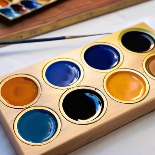
At the end of the day, mastering your color mixing isn’t about becoming a chemist or a theoretical scholar; it is about professional agency. We have spent this time discussing how value dictates your price point and how theory provides the structural integrity your work needs to survive a collector’s scrutiny. If your colors are muddy, if your values are flat, or if your saturation feels accidental, you aren’t just making a technical error—you are devaluing your own brand. You cannot expect a gallery to defend a premium price tag for work that looks like it was composed by someone still guessing at the relationship between ochre and ultramarine. Precision in your palette is the difference between an amateurish hobbyist and a disciplined professional who knows exactly what they are putting on the market.
Don’t let the technicality of it intimidate you into playing it safe with a limited, timid range. Instead, use this knowledge to command the canvas with intention. When you understand the mechanics of how pigments interact, you stop being a slave to the tube and start becoming the master of the visual experience you are selling. Go back to your studio, get your hands dirty, and stop apologizing for the colors you choose. Treat your palette with the same respect you treat your business contracts, and I promise you, the market will eventually start treating your work with that same level of seriousness.
Frequently Asked Questions
If I’m mixing my own colors to save on professional pigment costs, how do I ensure my work doesn't look "cheap" or amateurish to a high-end collector?
Oil on canvas, 40cm x 40cm, 2024. I’ll tell you now: collectors don’t care about your overhead, they care about lightfastness and depth. If you’re substituting expensive cadmiums with student-grade earths to save a few pounds, you’re sabotaging your secondary market value. Cheap pigments go muddy or fade, and a faded painting is a liability, not an asset. If you mix your own, master your values; if the luminosity is there, the price follows.
How much does the physical quality of my color mixing—specifically the consistency and layering—actually impact the appraised value of a finished piece?
Oil on canvas, 40x50cm, 2024. If your layers are muddy or your consistency is amateurish, you aren’t just making a technical error; you’re devaluing your inventory. Collectors pay for the “glow”—that optical depth achieved through disciplined glazing and structural integrity. When an appraiser looks at a piece, they look for stability. If the paint looks slapped on or chemically unstable, the perceived longevity vanishes, and with it, your ability to command a premium price.
At what point does mastering a complex color palette become a distraction from developing a cohesive, marketable style that a gallery can actually sell?
Oil on canvas, 40cm x 40cm, 2024. I’ll tell you the truth: the moment your palette becomes a technical exercise rather than a visual language, you’ve lost the plot. Collectors don’t buy your ability to mix a perfect tertiary violet; they buy the atmosphere that violet creates. If you’re spending more time chasing every hue in the spectrum than you are defining your own visual signature, you aren’t an artist—you’re a chemist. And chemists don’t have signatures.
