

I remember standing in my gallery back in ’98, staring at a landscape that had cost a local collector three months’ salary, only to realize the artist had completely botched the light. They’d used every expensive pigment in the tube, but because they didn’t understand the actual physics of how colour works in painting, the whole thing looked like a bruised fruit. It wasn’t a lack of talent; it was a lack of visual authority. Most art schools will spend three years teaching you how to mix a perfect violet, but they rarely mention that if your values are off, that violet is just going to look like expensive mud sitting on a canvas.
I am not here to give you a lecture on the color wheel or some romanticized nonsense about “feeling” your way through a palette. Instead, I’m going to tell you how colour actually functions as a tool for value, depth, and, most importantly, marketability. We are going to strip away the academic fluff and look at the mechanics of light and pigment so you can stop guessing and start making work that actually commands a room.
The Deception of Color Wheel Fundamentals
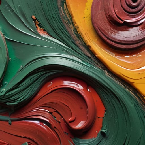
Every art school graduate arrives in my gallery with a pristine understanding of color wheel fundamentals, yet most of them can’t actually manage a palette. They know that red sits opposite green, but they don’t understand how that theoretical knowledge collapses when you’re actually mixing pigments for painters. In a textbook, a complementary color scheme looks clean and balanced; on a canvas, if you haven’t mastered the grit of real-world application, it looks like a vibrating, nauseating mess that no serious collector wants hanging in their living room.
The real deception lies in the gap between theory and light. You can follow every rule regarding warm and cool color palettes to the letter, but if you ignore the interplay of value and saturation in art, your work will lack the structural integrity required to command a high price point. A painting isn’t just a collection of hues; it is a calculated manipulation of light. Collectors aren’t paying for your ability to follow a diagram; they are paying for the way you control the eye through sophisticated tonal shifts.
Why Value and Saturation in Art Dictate Price Tags
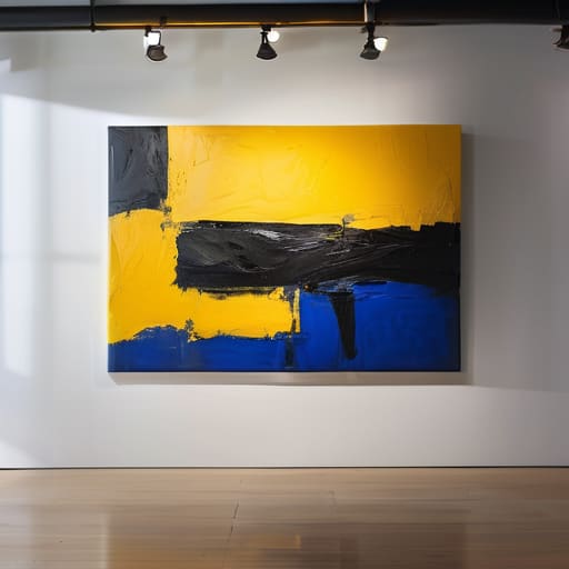
Here is the reality of the showroom floor: collectors don’t fall in love with a concept; they fall in love with how a canvas commands the room. This usually comes down to the interplay of value and saturation in art. You can have the most profound intellectual message in the world, but if your painting is a muddy, mid-tone mess with no structural hierarchy, it will sit in my gallery gathering dust. A piece with high-contrast values—the ability to guide the eye from a deep shadow to a piercing highlight—creates a sense of visual authority that justifies a premium price.
I’ve seen countless artists struggle because they treat color like a decorative afterthought rather than a structural tool. They get lost in the nuances of complementary color schemes but forget that without proper value control, those colors just bleed into one another. When a collector looks at a work, they are subconsciously looking for “presence.” A painting that masters saturation—knowing exactly where to place a concentrated burst of pigment against a restrained background—feels expensive. It feels intentional. If your work lacks that punch, you aren’t selling fine art; you’re selling wallpaper.
The High Cost of Pretty Pigments
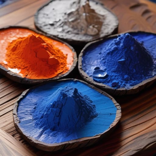
“A collector isn’t paying for your ability to mix a pretty sunset; they are paying for the visual authority that comes from knowing exactly when to hold back the saturation so the rest of the canvas can actually breathe. If you use every tube of expensive cadmium in the kit just to prove you can, you aren’t making a masterpiece—you’re making a loud, expensive mess that no serious collector will ever want to live with.”
Vivienne Ashworth-Pryce
Beyond the Pigment
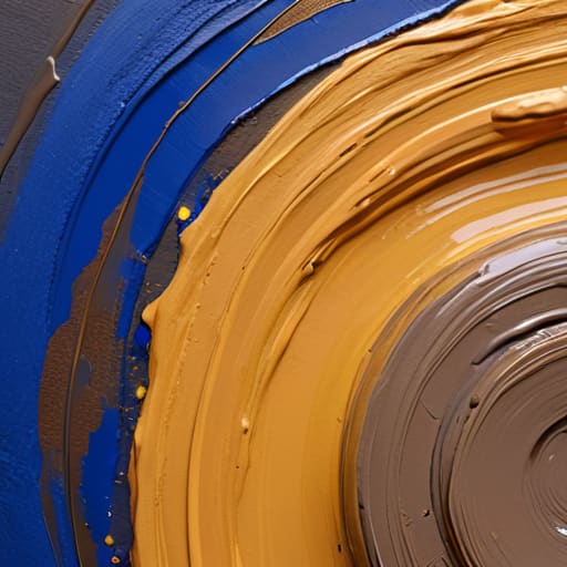
At the end of the day, understanding color isn’t about memorizing a wheel or playing with pretty hues; it’s about mastering the mechanics of perception. We’ve looked at how the basic color wheel is often a lie that ignores how light actually behaves, and how the real heavy lifting—the part that actually justifies a five-figure price tag—is done through the careful manipulation of value and saturation. If you ignore how a desaturated tone can provide the necessary “breathing room” for a high-chroma focal point, you aren’t painting; you’re just making visual noise. A collector isn’t buying a collection of pigments; they are buying the visual authority that comes from knowing exactly how much weight each color carries on the canvas.
Don’t let the technicality of it intimidate you into playing it safe. The market is saturated with artists who are terrified of making a mistake, so they stick to muddy, predictable palettes that ultimately say nothing. My advice? Use what you’ve learned about the physics of light to take calculated risks. When you finally understand how to balance a composition using nothing but temperature and value, you stop being a technician and start being a master of the medium. That is the moment your work moves from being a mere decoration to being a necessary acquisition for a serious collector.
Frequently Asked Questions
If I'm using high-quality pigments that look stunning in the studio, why does the painting suddenly look "dead" or muddy once it's under gallery lighting?
Oil on canvas, 40x50cm, 2024. It’s a heartbreak I’ve seen a thousand times. You’ve spent a fortune on professional-grade pigments, only for the work to lose its soul the moment it hits the floor. The problem isn’t your talent; it’s that studio light is a liar. Gallery spots are directional and aggressive. They flatten your nuances and turn subtle glazes into sludge. If you haven’t painted for high-CRI lighting, you aren’t finished.
At what point does a bold, experimental color palette stop being "brave" and start being a liability for a collector looking for a long-term investment?
Oil on canvas, 40cm x 40cm, 2024. I like the audacity, but let’s be honest. A palette becomes a liability the moment it ceases to serve the composition and begins to demand it. If a collector feels they have to “fight” the painting to live with it, you haven’t made a statement; you’ve made a headache. Bravery is intentional; chaos is just a lack of discipline, and collectors don’t invest in indecision.
How much should I actually be factoring the cost of professional-grade color accuracy into my final retail pricing?
Oil on canvas, 24×30, 2024. I love the question. You aren’t just paying for pigment; you’re paying for the insurance that the cobalt blue the collector sees in your studio is the same blue that arrives in their living room. If you’re using student-grade junk that shifts under gallery lighting, you’re sabotaging your resale value. Factor in the premium for lightfast, professional pigments as a direct line item in your overhead. Don’t hide it; it’s part of the quality.
