

I remember sitting in the back of a lecture hall thirty years ago, watching a professor describe pigment theory as if it were a sacred, untouchable liturgy. He spoke about the “soul of the spectrum” while I sat there thinking about the actual, messy reality of a muddy landscape painting that wouldn’t sell because the artist didn’t understand basic saturation. Most instructors treat the subject like a magic trick designed to make them feel superior, but let’s be clear: understanding how colour mixing actually works has nothing to do with mysticism and everything to do with chemical reality. If you’re waiting for a divine spark to tell you why your ochre turned into something resembling wet cardboard, you’re going to be waiting a very long time.
I am not here to teach you the romanticized nonsense you’ll find in a thousand-dollar masterclass. Instead, I’m going to give you the unvarnished truth about how light, pigment, and medium interact to create value and chroma. We are going to strip away the academic fluff and look at the practical mechanics that actually dictate whether a collector sees a masterpiece or a muddy mess.
Light Absorption and Reflection the Real Cost of Pigment
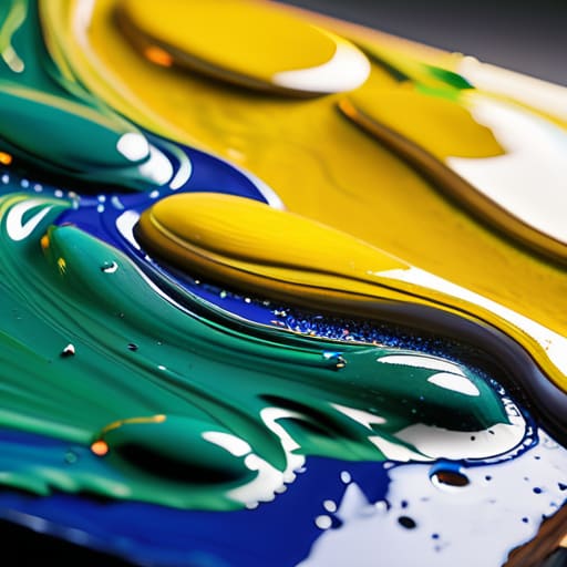
Most artists treat their palette like a magic wand, but it’s actually a battlefield of physics. When you squeeze a tube of Ultramarine onto your board, you aren’t just “making blue”; you are selecting a specific tool for light absorption and reflection. Every pigment you layer is essentially a filter that decides which wavelengths of the visible light spectrum are allowed to bounce back to the viewer’s eye and which are swallowed up by the paint. If you don’t respect this, you end up with that muddy, lifeless grey that makes a collector turn their head away from a piece before they’ve even processed the subject matter.
This is where the distinction between the additive vs subtractive color models becomes a matter of professional survival rather than academic trivia. In a digital screen, you’re adding light; in your studio, you are relentlessly subtracting it. Every time you mix a heavy cadmium with a cool earth tone, you are narrowing the range of light that can escape the canvas. If you ignore the way chromaticity and saturation collapse under too much heavy-handed mixing, you aren’t just making a technical error—you are literally devaluing the visual energy of the work.
Additive vs Subtractive Color Models Why Your Vision Lies

Most art schools will hand you a dusty, red-rimmed RYB color wheel and tell you that red, yellow, and blue are the gods of the universe. It’s a convenient lie that keeps students from having to understand the actual physics of the visible light spectrum. In reality, when you are standing in front of a canvas, you are working within the subtractive color model. You aren’t creating light; you are destroying it. Every time you layer a stroke of pigment, you are essentially telling certain wavelengths of light to go die.
This is where the disconnect happens between what your eye perceives and what your tube of paint actually does. Digital screens use additive color—adding light to reach white—while your oil paints work by subtracting light to reach black. If you don’t grasp this distinction, you’ll spend half your life trying to mix a vibrant violet only to end up with a muddy, grayish sludge that looks like dishwater under gallery lights. Understanding additive vs subtractive color models isn’t just for physicists; it is the difference between a painting that vibrates with life and one that looks dead on arrival.
The Illusion of the Palette
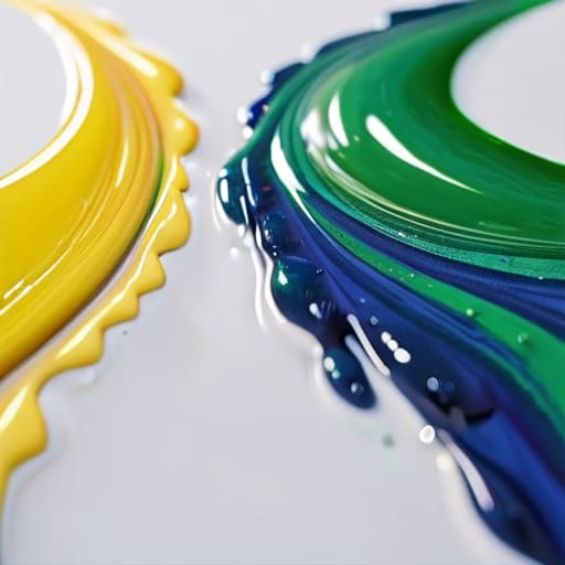
Stop thinking of color mixing as a way to find a new shade; think of it as a way to manage light. When you muddy your pigments because you don’t understand the physics of absorption, you aren’t being ‘nuanced’—you’re simply creating a surface that refuses to hold a collector’s eye.
Vivienne Ashworth-Pryce
Beyond the Palette

At the end of the day, understanding the physics of light and the stubborn reality of subtractive color isn’t about turning you into a scientist; it’s about stopping you from wasting expensive pigment on muddy, unintentional compromises. You now know that what you see on your palette is a physical manipulation of light absorption, a delicate dance between the chemical properties of your tubes and the environment in which the work will eventually hang. If you ignore the way pigments interact, you aren’t just making a technical error—you are undermining the structural integrity of your visual language. When a collector stands in front of a canvas, they aren’t just seeing a color; they are seeing the intentionality of light captured through your mastery of these very principles.
Don’t let the complexity of the science intimidate you into playing it safe with a limited, dull palette. Use this knowledge as a tool for liberation rather than a set of restrictive rules. Once you grasp how color actually behaves, you stop guessing and start commanding the eye. The goal isn’t to achieve a perfect mathematical formula, but to use these laws to create a visceral, emotional truth that justifies the price tag on your work. Go back to your studio, mix with purpose, and remember that mastery is found in the nuance between the theory and the stroke.
Frequently Asked Questions
If I’m mixing colors based on how they look under my studio lights, why do they look completely different—and often cheaper—once they’re hanging in a collector's dimly lit living room?
Oil on canvas, 40x50cm, 2024. It’s the oldest heartbreak in the business. You’ve mastered your studio’s high-CRI LEDs, but you’ve forgotten that light is the medium, not just the convenience. When that work moves from your controlled environment to a collector’s warm, dim incandescent bulb, the blue undertones vanish and the muddy pigments take over. If you don’t mix for the reality of domestic lighting, you aren’t selling art; you’re selling a lie that fails upon delivery.
How much of my profit margin is being swallowed up by the fact that I’m buying "convenient" pre-mixed tubes instead of understanding the raw pigment math myself?
Oil on linen, 12×12, 2024. You’re bleeding money, darling. Those “convenient” tubes are a luxury tax on your ignorance. You aren’t just paying for the pigment; you’re paying for the factory’s marketing, the plastic packaging, and the convenience of not having to think. If you’re selling work at a mid-market price point, that margin gap is massive. Stop buying the brand and start buying the raw pigment; it’s the only way to actually own your overhead.
Does the chemical stability of these pigments actually matter to a buyer, or am I just overthinking the science while they're only looking at the vibrancy?
Oil on canvas, 40cm x 40cm, 2024. You’re not overthinking it; you’re thinking about the long game. A collector isn’t just buying a mood; they are buying an asset. If that “vibrant” cadmium red turns to a muddy grey in ten years because you used a cheap fugitive substitute, you haven’t just failed the painting—you’ve failed the client. Professionalism is ensuring the work survives the person who bought it.
