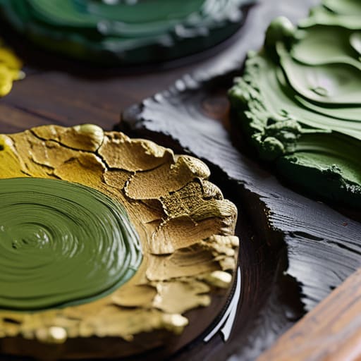

I remember sitting in the back of a crowded studio during a mid-career workshop in the late nineties, watching a young landscape painter struggle with a massive, muddy canvas. He was surrounded by every expensive pigment imaginable, yet his forest looked less like nature and more like a pile of wet spinach. He was searching for a magic formula, a secret tube of pigment that would finally teach him how to paint greens convincingly, when the truth was far more unromantic. He didn’t need more expensive supplies; he needed to stop treating green as a color and start treating it as a relationship between light and decay.
I am not here to sell you a masterclass on color theory or peddle some overpriced set of synthetic earth tones. Instead, I’m going to tell you what I learned from twenty-six years of seeing which canvases actually commanded a room and which ones looked like amateurish experiments. We are going to strip away the academic fluff and focus on the practical reality of pigment mixing and value control. By the end of this, you’ll understand the mechanics of the palette so you can stop fighting the medium and start creating depth that collectors actually want to hang on their walls.
Avoiding Artificial Looking Greens Through Subtractive Color Mixing
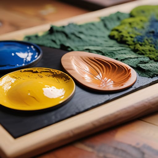
Most beginners make the mistake of treating green as a destination rather than a journey. They reach for the tube, squeeze out a dollop of Sap Green, and call it a day. That is your first mistake. When you rely solely on pre-mixed pigments, you aren’t painting nature; you’re painting a plastic lawn. To move beyond that, you must embrace subtractive color mixing for artists, which means understanding that real foliage is a chaotic, shifting mess of broken tones.
If you want to master mixing natural foliage colors, you have to stop thinking in terms of “adding green” and start thinking in terms of chromatic relationships. Nature doesn’t work in primaries; it works in complements. If your shadows look like muddy black holes, it’s because you haven’t used the warmth of a red or the depth of a violet to pull the green back into reality. True depth comes from the tension between those opposing hues. If you can’t manipulate the temperature of your pigments, you’ll never achieve the organic complexity required to satisfy a collector’s eye.
The Color Theory for Landscape Painters They Dont Teach You
The problem with most art school instruction is that it treats color theory like a math equation rather than a biological reality. They teach you that Blue plus Yellow equals Green, and they leave it at that. If you follow that logic in a landscape, you’ll end up with a field that looks like it was painted by a child with a box of crayons—neon, vibrating, and utterly lifeless. Real color theory for landscape painters isn’t about finding the right formula; it’s about understanding that nature rarely uses “pure” colors. Every leaf is a chaotic mess of decay, sunlight, and shadow.
To get it right, you have to stop thinking in terms of “green” and start thinking in terms of chromatic relationships. When you are mixing natural foliage colors, your goal isn’t to hit a specific hue on the wheel, but to manage the temperature shifts. A shadow in a cluster of ferns isn’t just a darker green; it’s a deep, desaturated violet or a bruised ochre. If you don’t learn to lean into those complementary colors in nature, your work will always lack the structural weight required to command a room—or a collector’s attention.
The Collector's Eye and the Green Trap
If I walk into a studio and see a landscape that looks like it was painted with a handful of neon highlighters, I know immediately that the artist is chasing a feeling rather than understanding a form. A collector isn’t looking for a postcard of a forest; they are looking for the weight of the light filtering through the canopy. If your greens are just a bright, unthinking layer of pigment slapped onto a canvas, you aren’t painting nature—you’re just making visual noise that no serious collector will ever hang in their home.
Vivienne Ashworth-Pryce
Beyond the Tube
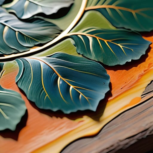
At the end of the day, convincing greens aren’t found in a pre-mixed tube of Sap Green or any other convenient lie sold by the manufacturer. It comes down to what we’ve discussed: abandoning the shortcut of additive thinking and embracing the messy, necessary reality of subtractive mixing. You have to understand how your local pigments interact, how temperature shifts from the warmth of a sun-drenched leaf to the cool shadow of a trunk, and how to avoid that dreaded, plastic-looking neon that screams “amateur” to any collector with an eye. If you aren’t willing to do the work to muddy your pigments properly, you aren’t painting nature; you’re just decorating a surface.
Don’t let the technicality of color theory intimidate you into playing it safe with a limited, muddy palette. The goal isn’t to achieve a perfect scientific formula, but to capture the vibrancy of life through intentionality. When you finally stop fighting the pigments and start directing them, your work will move from being a mere representation of a landscape to something that feels lived-in and breathing. Go back to your easel, stop reaching for the easy colors, and start building your own truth one layer at a time. That is how you make work that people actually want to bring into their homes.
Frequently Asked Questions
If I’m mixing my own greens to avoid that "plastic" look, how do I stop my palette from turning into a muddy, unusable mess by the end of the session?
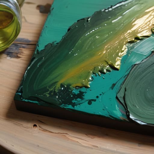
Oil, 12×12, 2024. It’s a classic mistake, dear. You aren’t just mixing colors; you’re managing a biological hazard on a piece of wood. The moment you start dragging a dirty brush into a fresh pile of Viridian, you’ve lost. Keep your “clean” mixing area strictly separated from your “dirty” sludge. Use a larger palette than you think you need, and for heaven’s sake, clean your knife between every single hue. Discipline prevents mud.
At what point does a "natural" green become too desaturated to actually read as foliage in a composition?
It becomes unreadable the moment the value collapses into the background. I’ve seen countless landscape paintings where the artist, terrified of looking “unnatural,” mutes the greens so thoroughly that the foliage loses its structural integrity. If your green has the same tonal weight as the shadows behind it, you haven’t painted a tree; you’ve painted a smudge. You need enough chromatic punch to define the form, or you’re just asking the collector to squint.
How much of my green should be built from the local light temperature versus the actual pigment of the plant itself?
Oil on canvas, 12×12, 2024. If you lean too hard on the pigment, your landscape will look like a botanical illustration—stiff, clinical, and frankly, boring. If you lean too hard on the light, it becomes a muddy mess. The secret is that the light is the protagonist. The plant is just the stage. Use the pigment to establish the identity, but let the local light temperature do the heavy lifting of making it feel real.
